One of the key parts of data analysis is to use summary statistics to understand the trend in the data. Understanding the variability in such summary statistics can be extremely useful to put weight on such summary statistics. Bootstrapping, resampling data with replacement is an extremely useful tool to quantify uncertainty. It was originally developed by Brad Efron and wikipedia article nicely explains it as
The basic idea of bootstrapping is that inference about a population from sample data (sample → population) can be modelled by resampling the sample data and performing inference about a sample from resampled data (resampled → sample). As the population is unknown, the true error in a sample statistic against its population value is unknown. In bootstrap-resamples, the ‘population’ is in fact the sample, and this is known; hence the quality of inference of the ‘true’ sample from resampled data (resampled → sample) is measurable.
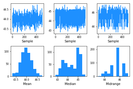
Pandas has a really nice function called “bootstrap_plot()” to visualize the uncertainty. Pandas bootstrap_plot() function make a quick plot for common summary statistics like mean and median with a specified number of bootstrapped samples of fixed size.
Let us load the packaged needed.
import pandas as pd
import numpy as np
import seaborn as sns
import matplotlib.pyplot as plt
Let us import bootstrap_plot() function from pandas.plotting module.
from pandas.plotting import bootstrap_plot
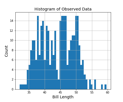
We will use Palmer penguin data to understand the uncertainty in summary statistics computed on bill lengths mesasured on penguins.
data = sns.load_dataset("penguins")
data = data.dropna()
Let us quickly make a histogram of bill length using Pandas hist() function to see the distribution of bill length.
data.bill_length_mm.hist(bins=50)
We can use bootstrap_plot() to understand the variability in our estimates of three measures of central tendency, mean, median and mid-range, of the observed data, Here we use the bill length for illustration. In this example, we sample 200 observation from our observed bill length with replacement for 500 times and estimate the the three statistics on each such sample.
bootstrap_plot(data["bill_length_mm"],
               size=200,
               samples=500,
               color="dodgerblue")
And Pandas’ bootstrap_plot() makes two types of plot for each of them and they show how reliable our estimate of mean/median/midrange is.