When you have multiple variables you might want to quickly look at how each variable is distributed and how each variable is related to other variables. Basically, we are interested in histograms of each variable and scatter plots for all pairs of variables.
Seaborn’s pairplot enables us to make such a plot containing a matrix of bunch of plots.
In this tutorial, we will see multiple examples of making Pairplot or scatter plot matrix using Seaborn’s pairplot() function.
Let us first load Seaborn and Matplotlib for making the pairplot.
import seaborn as sns
import matplotlib.pyplot as plt
Let us use Seattle weather data available from vega_datasets. We import data from vega_datasets package.
from vega_datasets import data
seattle_weather = data.seattle_weather()
Seattle weather data contains six columns.
print(seattle_weather.head(n=3))
       date  precipitation  temp_max  temp_min  wind  weather
0 2012-01-01            0.0      12.8       5.0   4.7  drizzle
1 2012-01-02           10.9      10.6       2.8   4.5     rain
2 2012-01-03            0.8      11.7       7.2   2.3     rain
Simple Pairplot with Seaborn
To make simplest pairplot, we provide the dataframe containing multiple variables as input to Seaborn’s pairplot() function.
sns.pairplot(seattle_weather)
We get a pairplot matrix containing histograms for each variable in the dataframe and scatter plots for all pairs of variables in the dataframe.

Coloring Pairplot with Seaborn
By default, Seaborn’s pairplot colors the data points in blue. We can also add colors to the pairplot based on values of a specific variable.
In this example, we color the data points using the weather variable in our data. We provide the weather variable to the argument “hue”.
# coloring pairplot with seaborn
sns.pairplot(seattle_weather, hue="weather")
Seaborn’s pairplot splits the data by the hue variable and makes histograms for each value of hue variable and also color data points by the variable.

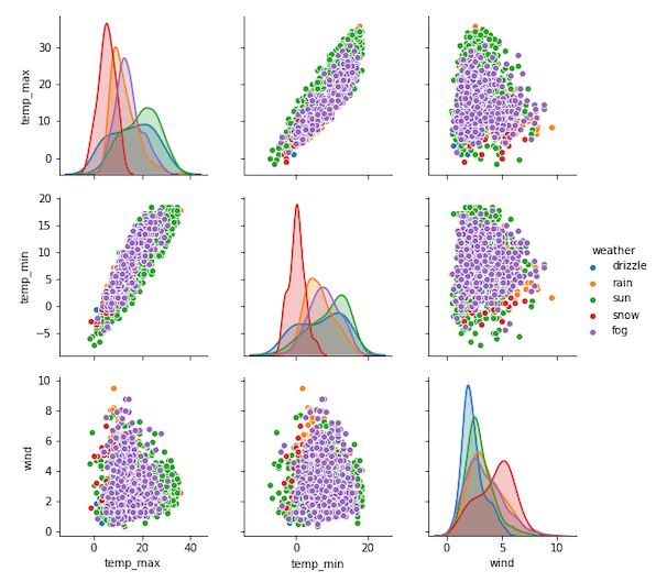
Pairplot of Select variables with Seaborn
Although Seaborn’s pairplot is excellent tool for exploratory data visualization, it is not that useful if you have too many variables.
To alleviate that a bit, we can select specific variables from the data and make pairplot with them.
To select a variable of interest, we provide the variables of interest as a list to “vars” argument to Seaborn’s pairplot function.
# pairplot of select variables with seaborn
sns.pairplot(seattle_weather, vars=["temp_max","temp_min", "wind"], hue="weather")
In this example, we have selected variables and made a pairplot with them. We have also colored the plot using a variable from the data.