
Creating effective bar plots in ggplot2 requires knowing which function to use for your data structure. This comprehensive guide demonstrates three essential approaches—geom_bar() for raw data, geom_col() for summarized values, and stat_count() for explicit control—with practical … [Read more...] about 3 Different ways to make bar plots with ggplot2
How to specify the order of panes in facet_wrap
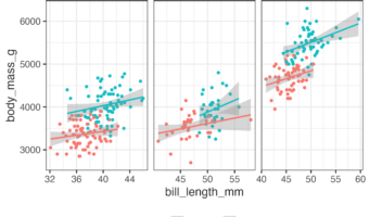
In this tutorial, we will learn how to change the order of panes in a plot made with facet_wrap() or facet_grid(). We will use forcats package's function fct_relevel() to specify the order we want while plotting. Let us make a scatterplot with facets using … [Read more...] about How to specify the order of panes in facet_wrap
How to Format Date in title text in ggplot2
In this tutorial, we will learn how to format date variables in the title text of a plot made with ggplot2. Sometimes one might want to write date in the title text. It is better to use the date as variable and format the way want, either full month or short month or full/partial … [Read more...] about How to Format Date in title text in ggplot2
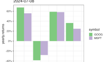
How to Add matching colors to keywords in title text
This tutorial teaches you how to color words in a ggplot title to match the data in the plot itself. This approach has two main benefits: Improves interpretation: Readers can understand the chart more quickly. Reduces clutter: It can eliminate the need for a … [Read more...] about How to Add matching colors to keywords in title text
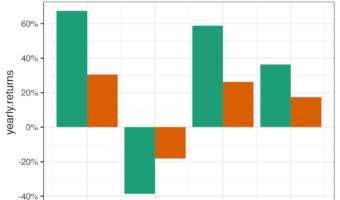
How to selectively add color to title text in ggplot2
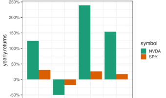
In this tutorial, we will learn how to specify colors to selective words of title text in ggplot2. For example, if we had made a plot with ggplot2 and have title text to describe the plot, we will learn how to color certain words of the title not the whole title text. We will … [Read more...] about How to selectively add color to title text in ggplot2