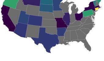
Creating maps is one of the most powerful ways to visualize data, and R's ggplot2 package makes it surprisingly straightforward. In this tutorial, you'll learn how to build beautiful and informative US maps from the ground up. We’ll guide you step-by-step through creating … [Read more...] about How To Make US State and County Level Maps in R?
Hierarchically-clustered Heatmap in Python with Seaborn Clustermap

In this post, we will learn how to make hierarchically clustered heatmap in Python. We will use Saeborn's Clustermap function to make a heat map with hierarchical clusters. Seaborn's Clustermap is very versatile function, but we will showcase the use of the function with just one … [Read more...] about Hierarchically-clustered Heatmap in Python with Seaborn Clustermap
How To Avoid Overlapping Labels in ggplot2?
A common problem in making plots, say a barplot or boxplot with a number of groups is that, names of the groups on x-axis label often overlap with each other. Till now, one of the solutions to avoid overlapping text x-axis is to swap x and y axis with coord_flip() and make a … [Read more...] about How To Avoid Overlapping Labels in ggplot2?
How To Make Ridgeline plot in Python with Seaborn?

Ridgeline plots are great to visualize numerical distributions corresponding to multiple groups or categorical variables. Ridgeline plots make density plots or histograms for each group one on top of each other and thus making it look like "a mountain range". They are great for … [Read more...] about How To Make Ridgeline plot in Python with Seaborn?
Multiple Line Plots or Time Series Plots with ggplot2 in R
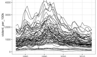
Line plots or time series plots are helpful to understand the trend over time. In this post we will learn how to make multiple line plots (or time-series plots in the sample plot) in R using ggplot2. Let us load tidyverse the suite of R packages including ggplot2 to make the … [Read more...] about Multiple Line Plots or Time Series Plots with ggplot2 in R