
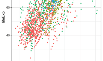
Grouped barplot allows to show third categorical variable in the barplot. Sometimes, when we make grouped barplot using ggplot2, some of the bars would have much broader width sizes. We typically get bars with uneven widths in a grouped barplot when some of the groups don't have … [Read more...] about How to Make Grouped Barplots with Same Bar Width
How To Fold Legend into Multiple Rows/Columns in ggplot2
When plotting with ggplot2 in R, long legends can sometimes overflow, look cluttered, or even get cut off when placed at the top or bottom of a chart. This is especially common when you have many categories (e.g., years or groups) and want the legend to be clearly readable. … [Read more...] about How To Fold Legend into Multiple Rows/Columns in ggplot2
How to Add Labels Directly in ggplot2. Hint: Use Secondary Axis Trick

Legends can be of great help to understand a plot. Typically, ggplot2 adds legend by default on right side of the plot based on the variable that we used to color or fill. However, as Cluas Wilke says in his fantastic book on Data Visualization, legends can make the plot … [Read more...] about How to Add Labels Directly in ggplot2. Hint: Use Secondary Axis Trick
How To Customize Border in facet in ggplot2
Faceting in ggplot2 is one of the most powerful ways to create small multiples—a series of plots split by a grouping variable. With facet_wrap() and facet_grid(), you can easily compare distributions, trends, or relationships across categories. New to facets? Start here: How … [Read more...] about How To Customize Border in facet in ggplot2
How To Make PCA Plot with R
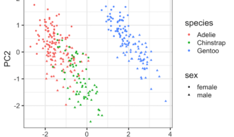
Principal Component Analysis (PCA) is one of the commonly used methods used for unsupervised learning. Making plots using the results from PCA is one of the best ways understand the PCA results. Earlier, we saw how to make Scree plot that shows the percent of variation explained … [Read more...] about How To Make PCA Plot with R