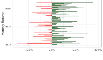
In this tutorial, we will learn how to visualize a company’s stock return over time. A stock's return is defined as the capital gains/losses and income from dividend. We will use the adjusted stock price to compute the nominal return using the fantastic tidyquant R … [Read more...] about Visualizing Stock Return of a Company Over Time with Barplots
Adding and Troubleshooting Text Annotations on a plot with ggplot2
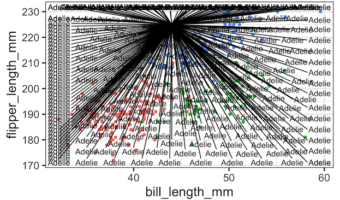
Adding text annotations to a plot can greatly help understanding a plot better. In this tutorial, we will learn couple of examples of adding text annotations to a scatter plot with three groups of samples. First we see couple of examples of what might typically go wrong while … [Read more...] about Adding and Troubleshooting Text Annotations on a plot with ggplot2
Visualizing Stock Price of a Single Company Over Time
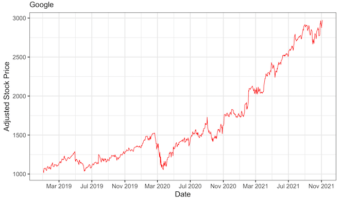
In this tutorial, we will learn how to visualize a company's stock price over time. Stock data is an example of time series data, where we have stock price of a company for a period of time. First, we will learn how to get stock price for a company of interest and use ggplot2 to … [Read more...] about Visualizing Stock Price of a Single Company Over Time
How to Color Barplots with R Color Brewer
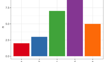
In this tutorial we will learn to how to color bars in a barplot using R Color Brewer's color palettes. R Color Brewer package "RColorBrewer" offers numerous color palettes that are useful in common situations. For example, it gives "Sequential" palette for ordered data, … [Read more...] about How to Color Barplots with R Color Brewer
How to Highlight Groups with Convex Hull in ggplot2
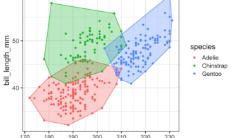
In this tutorial, we will learn how to annotate or add colors to multiple groups in a scatter plot made with ggplot2 in R using convex hull shapes. Convex hull is basically a box or polygon connecting the outermost data points for each group in a scatter plot with multiple … [Read more...] about How to Highlight Groups with Convex Hull in ggplot2