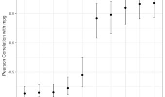
In this tutorial, we will learn how to compute correlation of one variable against multiple variables and make a plot showing the correlation values with error bars. This nice trick uses map() functions from purrr package to compute multiple correlations and uses broom's tidy() … [Read more...] about Correlation Dot Plot with Error Bar
How to Make Notched boxplots with ggplot2
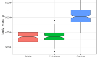
In this tutorial, we will learn how to make notched boxplots using ggplot2 in R. Notched boxplot is a variant of boxplot that helps comparing boxplots from different groups in a plot. "Notch" refers to the narrowing of the box around the median of the boxplot. If we are … [Read more...] about How to Make Notched boxplots with ggplot2
How to make rain cloud plots with ggdist
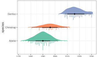
In this tutorial, we will learn how to make raincloud plots with the R package ggdist. In an earlier post, we learned how to make rain cloud plots with half violinplot, kind of from scratch. However, ggdist, an R package "that provides a flexible set of ggplot2 geoms and stats … [Read more...] about How to make rain cloud plots with ggdist
ggplot2 error: Cannot use `+.gg()` with a single argument.

In this post, we will learn how to fix one of the common ggplot2 error messages. While trying to make a ggplot2, we might get the following error. The error message here " Did you accidentally put + on a new line?" is bit helpful as it hints what is the cause of the error. … [Read more...] about ggplot2 error: Cannot use `+.gg()` with a single argument.
How to Make Heatmap with Matplotlib in Python

How to Make a Heatmap in Python with Matplotlib (Step-by-Step Guide) Heatmaps are a powerful way to visualize matrices and time-based data. They let you quickly spot trends, patterns, and seasonality in numbers. While libraries like Seaborn provide a high-level heatmap() … [Read more...] about How to Make Heatmap with Matplotlib in Python