Last updated on March 24, 2020
In this post, we will learn how to make multiple overlapping histograms in Python using Altair. Using Altair, we can make overlapping histograms or layers histograms from data that is in wide form and long tidy form.
We will see an example of making overlapping histograms from data in tidy form first and then from wide form data.
import pandas as pd
import altair as alt
import numpy as np
Let us generate data using NumPy’s random module in wide form first and then convert to tidy/long form.
np.random.seed(42)
# Generate random Data
df = pd.DataFrame({
    'Africa': np.random.normal(40, 10, 1000),
    'Asia': np.random.normal(55, 10, 1000),
    'Americas': np.random.normal(80, 10, 1000)
})
The Pandas dataframe we created is in wide form with each continent’s lifeExp values in separate columns.
df.head()

Africa	Asia	Americas
0	33.286265	56.708735	78.586568
1	32.862005	55.122554	68.174800
2	54.254059	50.688449	78.802943
3	58.644137	54.974733	81.479956
4	30.711175	59.908416	85.188345
Let us use Pandas’ melt() function to convert the data in wide form to long tidy form.
df_long = df.melt(var_name="continent", value_name="lifeExp")
Now we have data in both wide and tidy form. Let us go ahead and see how to make multiple histograms on the same plot from both of these type of data.
Multiple Overlapping Histograms in Altair Using Tidy/Long data
To make histogram with Altair, we need to use mark_area() function. Here we specify transparency level with opacity argument. And the key argument that makes histogram is interpolate=’step’. Without that the histogram would look like area chart from Altair.
Then we specify the variables and the number of bins. To make overlapping histograms, we need to specify alt.Color() variable with the categorical variable corresponding to multiple histograms.
alt.Chart(df_long).mark_area(
    opacity=0.5,
    interpolate='step'
).encode(
    alt.X('lifeExp:Q', bin=alt.Bin(maxbins=100)),
    alt.Y('count()', stack=None),
    alt.Color('continent:N')
).properties(
    title='Overlapping Histograms from Tidy/Long Data'
)
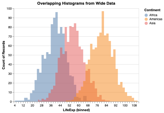
Now we have made multiple overlapping histograms from wide data. Without alt.Color() variable, we will get a single histogram using all the data.

Multiple Overlapping Histograms in Altair Using Wide data
Often you might start with data that is in wide form. Altair has trasnform_fold() function that can convert data in wide for to tidy long form. This allows us not to use Pandas’ melt() function and lets us transfor the data within Altair.
Let us use Altair’s transform_fold() to reshape wide data to tidy/long data and make overlapping histograms in Python.
We specify the variables names that need to reshaped and names for new variables in the tidy data within transfor_fold() first, as shown below.
alt.Chart(df).transform_fold(
    ['Africa', 'Asia', 'Americas'],
    as_=['Continent', 'LifeExp']
).mark_area(
    opacity=0.5,
    interpolate='step'
).encode(
    alt.X('LifeExp:Q', bin=alt.Bin(maxbins=100)),
    alt.Y('count()', stack=None),
    alt.Color('Continent:N')
).properties(
    title='Overlapping Histograms from Wide Data'
)
We get the same overlapping histogram, but this time with wide data using Altair’s transform_fold() function.