When you have data for a variable corresponding to multiple groups, visualizing the data for each group can be useful. One of the techniques to use is to visualize data from multiple groups in a single plot. However, a better way visualize data from multiple groups is to use “facet” or small multiples. ggplot2 makes it really easy to create faceted plot.
In this post, we will learn how to make a simple facet plot or “small multiples” plot. In a facet plot. we split the data into smaller groups and make the same plot for each group. This would yield a multi-panel plot of the same type.
Let us load tidyverse to make the faceted plot using ggplot2.
# load tidyverse packages
library(tidyverse)
# set plott theme and label size
theme_set(theme_bw(base_size = 16))
We will use 2019 Stackoverflow survey data to make facetted plot using ggplot2 in R. We will directly load the processed data from datavizpyr.com‘s github page.
# github link to data
stackoverflow_file <- "https://raw.githubusercontent.com/datavizpyr/data/master/SO_data_2019/StackOverflow_survey_filtered_subsampled_2019.csv"
# read the data directly from github
survey_results <- read_csv(stackoverflow_file)
The processed survey data has multiple variables.
## Parsed with column specification:
## cols(
##   CompTotal = col_double(),
##   Gender = col_character(),
##   Manager = col_character(),
##   YearsCode = col_character(),
##   Age1stCode = col_character(),
##   YearsCodePro = col_character(),
##   Education = col_character()
## )
We will mainly focus on Salary and education information and make density plot of salary for each educational category.
Let us first subset the data and do some cleaning by removing rows with missing Education values and removing Professional degrees for the sake of making a simple facet plot.
df <- survey_results %>%
  select(CompTotal, Education) %>%
  filter(!is.na(Education)) %>%
  filter(Education!="Professional")
After cleaning and filtering, we have four educational category, instead of five. Now, we are ready to make our first facet plot and our data looks like this.
df %>%
   head()

## # A tibble: 6 x 2
##   CompTotal Education
##       <dbl> <chr>
## 1    180000 Master's
## 2     55000 Bachelor's
## 3     77000 Bachelor's
## 4     67017 Bachelor's
## 5     90000 Less than bachelor's
## 6     58000 Bachelor's
In this example, we will make faceted density plots of Salary corresponding to different educational qualifications.
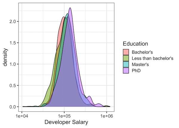
Before that, let us first naively start with single plot containing density plots for multiple educational category.
We can use ggplot2’s geom_density() function with fill argument inside aes() to make multiple density plot.
df %>%
  ggplot(aes(x=CompTotal, fill=Education))+
  geom_density(alpha=0.5)+
  scale_x_log10()+
  labs(x="Developer Salary")
Depending on the data you have, multiple density plots on a single plot can difficult to interpret. Here we can see that all four groups overlap quite a bit and make it difficult to compare.
facet plot with facet_wrap() in ggplot2
Faceting or making small multiples or a multi-panel plot with same plot for different groups is a great option that is worth considering.
One of the simple options to make facet plot using ggplot2 is to use facet_wrap() function. facet_wrap() function enables you to make multi-panel plot by simply splitting the data into small groups. We just just to provide the grouping variable as argument to facet_wrap().
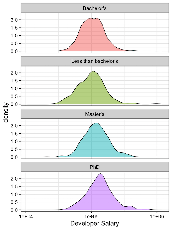
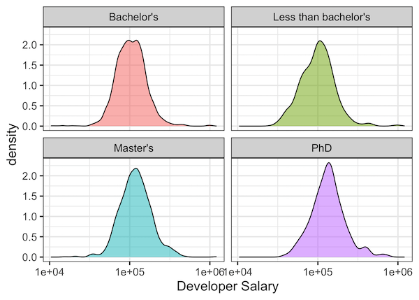
In this example, to make facet plot for each educational category, we have added facet_wrap(~Education) to our ggplot2 code.
df %>%
  ggplot(aes(x=CompTotal, fill=Education))+
  geom_density(alpha=0.5)+
  scale_x_log10()+
  facet_wrap(~Education)+
  theme(legend.position="none")+
  labs(x="Developer Salary")
And we get a nice facet plot with a density plot for each educational category. By default, ggplot2 has made the multi-panel facet plot in 2×2 matrix.
Customizing rows and columns in facet_wrap() in ggplot2
With facet_wrap() function we can also customize the dimension of the multi-panel. For example, instead of making facet plot in 2×2 matrix, we can make facet plot in a single column i.e. 1 x 4 matrix.
We can customize the number of columns or rows of facet plot with ncol or nrow argument to facet_wrap() function in ggplot2. In this example, we specify the number of columns to 1 with facet_wrap(~Education, ncol=1).
df %>%
  ggplot(aes(x=CompTotal, fill=Education))+
  geom_density(alpha=0.5)+
  scale_x_log10()+
  facet_wrap(~Education, ncol=1)+
  theme(legend.position="none")+
  labs(x="Developer Salary")
And we get a nice facet plot with single column. And this facet plot made with facet_wrap() makes it easy compare the salary density across different educational qualifications.