Last updated on February 19, 2020
In this post we will learn how to manually sort boxes in boxplot when using Seaborn’s boxplot function in Python.
Earlier we saw how to order a boxplot in Python by another variable, for example we ordered boxplot by mean/median using Seaborn. Sometimes, you may already know what order the boxes should be and want to make a boxplot with boxes in that specified order.
import seaborn as sns
import matplotlib.pyplot as plt
import pandas as pd
We will use the results from 2019 Stack Overflow Survey data as before, for making boxplots and manually ordering the boxes in boxplot.
data_url ="https://raw.githubusercontent.com/datavizpyr/data/master/SO_data_2019/StackOverflow_survey_filtered_subsampled_2019.csv"
data = pd.read_csv(data_url)
print(data.head(3))
Let us do clean up of the data by filtering out developers who are managers and with a minimum and maximum annual salary.
data_df=data.query('Manager=="IC"')
data_df=data_df.query('CompTotal<300000 & CompTotal>30000')
Seaborn Boxplot
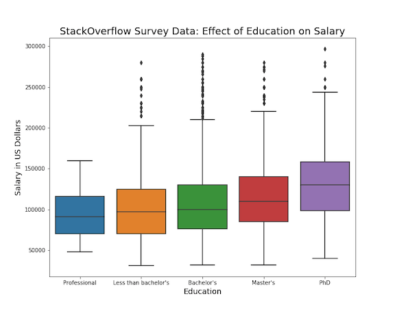
Seaborn’s boxplot() function is very handy and enables us to make boxplots easily and lets us customize the boxplot in many ways. We will first start with a simple boxplot with Seaborn boxplot. We plot educational categories on x-axis and salary on y-axis.
plt.figure(figsize=(10, 8))
sns.boxplot(x="Education", y="CompTotal", data=data_df)
plt.ylabel("Salary in US Dollars", size=14)
plt.xlabel("Education", size=14)
plt.title("StackOverflow Survey Data: Effect of Education on Salary", size=18)
plt.savefig("boxplot_Seaborn_Python.png")
Here we also specify x and y axis labels, a title for the boxplot. Seaborn nicely colors the boxes automatically for us.

How To Manually Order Boxes in Boxplot with Seaborn?
We can notice that boxes are ordered in no particular order. And sometimes you might like to order the boxes in certain way. In such senarios, we already know the order of boxes in boxoplot and want to display in that order.
Seaborn’s boxplot() function easily allows us to choose the order of boxplots using the argument “order”. The argument order takes a list ordered in the way we want. Here we manually specify the order of boxes using order as order=[“Professional”,”Less than bachelor’s”,”Bachelor’s”,”Master’s”, ‘PhD’].
plt.figure(figsize=(10, 8))
sns.boxplot(x="Education", y="CompTotal",
            order=["Professional","Less than bachelor's","Bachelor's","Master's", 'PhD'],
            data=data_df)
plt.ylabel("Salary in US Dollars", size=14)
plt.xlabel("Education", size=14)
plt.title("StackOverflow Survey Data: Effect of Education on Salary", size=18)
plt.savefig("manually_ordered_boxplot_Seaborn_Python.png")
And we get the manually ordered boxplot with Seaborn in Python.