Last updated on August 24, 2025
Struggling to visualize and find patterns in high-dimensional data? While PCA and tSNE are common, UMAP has emerged as a powerful, modern technique for dimensionality reduction.
This guide will show you not only how to create beautiful UMAP plots in R with ggplot2, but also how to interpret them to uncover meaningful insights in your data.
What is UMAP and Why Should You Use It?
Imagine your data is a crumpled ball of paper. In its 3D crumpled state, it’s hard to read the text written on it. Dimensionality reduction techniques like UMAP essentially “un crumple” and flatten the paper into 2D so you can see the patterns—which words are close to each other—more clearly.
UMAP (Uniform Manifold Approximation and Projection) is a modern algorithm that is exceptionally good at this.
So, why choose UMAP over other methods like PCA or t-SNE?
- Preserves Global Structure: Unlike t-SNE which is excellent at showing local clusters, UMAP often does a better job of preserving the larger, global relationships between clusters.
- Speed: UMAP is significantly faster than t-SNE, making it ideal for larger datasets.
- Interpretability: The resulting plots are often easier to interpret, showing clear separation between groups while maintaining their broader relationships.
Loading Data and Packages
In this post, we will use Palmer Penguin dataset to make a UMAP plot in R.
We will perform umap using the R package umap.
Let us load the packages needed and set the simple b&w theme for ggplot2 using theme_set() function.
library(tidyverse)
library(palmerpenguins)
#install.packages("umap")
library(umap)
theme_set(theme_bw(18))
To perform UMAP using Palmer Penguin’s dataset, we will use numerical columns and ignore non-numerical columns as meta data (like we did it for doing tSNE analysis in R). First, let us remove any missing data and add unique row ID.
UMAP, like other distance-based algorithms, requires clean, numeric inputs to work correctly. Therefore, our first step is to prepare the penguins dataset. We will start by removing any rows with missing values. \
Then, we will separate our numeric features (like flipper length and body mass) from the categorical metadata (like species and island), which we will use later for coloring and interpreting our final plot.
penguins <- penguins %>%
  drop_na() %>%
  select(-year)%>%
  mutate(ID=row_number())
## # A tibble: 6 x 8
##   species island bill_length_mm bill_depth_mm flipper_length_… body_mass_g sex
##   <fct>   <fct>           <dbl>         <dbl>            <int>       <int> <fct>
## 1 Adelie  Torge…           39.1          18.7              181        3750 male
## 2 Adelie  Torge…           39.5          17.4              186        3800 fema…
## 3 Adelie  Torge…           40.3          18                195        3250 fema…
## 4 Adelie  Torge…           36.7          19.3              193        3450 fema…
## 5 Adelie  Torge…           39.3          20.6              190        3650 male
## 6 Adelie  Torge…           38.9          17.8              181        3625 fema…
## # … with 1 more variable: ID <int>
Let us create a dataframe with all categorical variables with the unique row ID.
penguins_meta <- penguins %>%
  select(ID, species, island, sex)
Performing UMAP with umap package
Before we run the UMAP algorithm, it’s a critical best practice to scale the data. This ensures that variables with larger absolute values (like body_mass_g) don’t disproportionately influence the result compared to variables with smaller values (like bill_depth_mm). We will use the scale() function to standardize each numeric variable.
Let us select numerical columns using is.numeric() function with select(), standardise the data using scale() function before applying umap() function to perform tSNE.
set.seed(142)
umap_fit <- penguins %>%
  select(where(is.numeric)) %>%
  column_to_rownames("ID") %>%
  scale() %>%
  umap()
The umap result object is a list object and the layout variable in the list contains two umap components that we are interested in. We can extract the components and save it in a dataframe. Also, we merge the UMAP components with the meta data associated with the data.
umap_df <- umap_fit$layout %>%
  as.data.frame()%>%
  rename(UMAP1="V1",
         UMAP2="V2") %>%
  mutate(ID=row_number())%>%
  inner_join(penguins_meta, by="ID")
umap_df %>% head()

##        UMAP1     UMAP2 ID species    island    sex
## 1  -7.949633 -1.387130  1  Adelie Torgersen   male
## 2  -6.850185 -1.685802  2  Adelie Torgersen female
## 3  -6.753245 -2.485241  3  Adelie Torgersen female
## 4  -9.327034 -1.900235  4  Adelie Torgersen female
## 5 -10.353931 -1.381105  5  Adelie Torgersen   male
## 6  -7.273715 -1.689724  6  Adelie Torgersen female
UMAP plot: Scatter plot between two UMAP components
Our first UMAP plot visualizes the two primary components generated by the algorithm, with each point colored by its species. Notice how the algorithm, without any prior knowledge of the species labels, has naturally grouped the data into three distinct and well-separated clusters.
This powerfully demonstrates UMAP’s ability to uncover the primary underlying structure in the data. Each cluster corresponds almost perfectly to one of the penguin species (Adelie, Chinstrap, and Gentoo), confirming that the species is the dominant factor separating the penguins based on their physical measurements.
umap_df %>%
  ggplot(aes(x = UMAP1,
             y = UMAP2,
             color = species,
             shape = sex))+
  geom_point()+
  labs(x = "UMAP1",
       y = "UMAP2",
      subtitle = "UMAP plot")
ggsave("UMAP_plot_example1.png")
Our UMAP plot looks like this. Note, UMAP is unsupervised technique and has nicely identified three groups corresponding the species variable in the data.

UMAP plot in R: Example 2
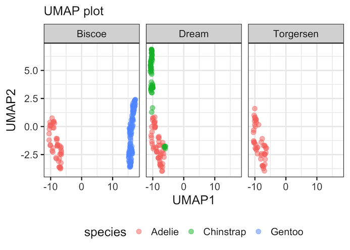
In the second example of UMAP plot, we have used the same UMAP components, but this time we have added facetting based on island variable to see the relationship between species and island more clearly.
Interpreting the Faceted Plot
By faceting the plot by the island variable, we can now explore a second layer of structure within our data. This view gives us new information that wasn’t immediately obvious from the first plot.
For example, we can see that all the Gentoo penguins in our dataset are found exclusively on Biscoe island. The Adelie penguins, however, are distributed across all three islands. This type of visualization allows us to see how the main clusters (species) relate to other categorical variables in our data, adding more depth to our analysis.
umap_df %>%
  ggplot(aes(x = UMAP1,
             y = UMAP2,
             color = species)) +
  geom_point(size=3, alpha=0.5)+
  facet_wrap(~island)+
  labs(x = "UMAP1",
       y = "UMAP2",
       subtitle="UMAP plot")+
  theme(legend.position="bottom")
ggsave("UMAP_plot_example2.png")
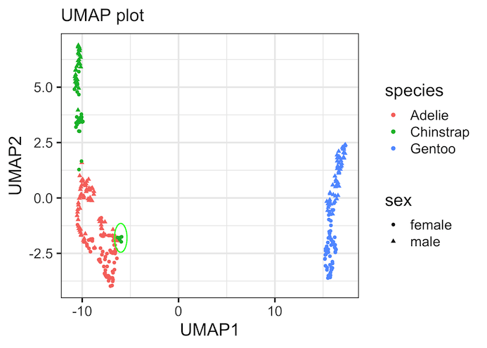
Using UMAP for Quality Control and Discovery
Perhaps the most valuable use of UMAP is for quality control and discovering new patterns or anomalies. In this plot, we’ve circled a few green points (Chinstrap) that are clustered much closer to the red points (Adelie) than to their own main group. This is a significant finding and a great example of a data-driven discovery.
This doesn’t automatically mean the data is “wrong,” but it prompts critical questions for the researcher: Was there a sample mix-up during data collection? Are these specific penguins biological outliers with unusual measurements? Could they be hybrids?
UMAP doesn’t provide the answer, but it acts like a powerful magnifying glass, directing you to the most interesting and questionable data points that require further investigation.
library(ggforce)
umap_df %>%
  ggplot(aes(x = UMAP1,
             y = UMAP2,
             color = species,
             shape = sex)) +
  geom_point() +
  labs(x = "UMAP1",
       y = "UMAP2",
       subtitle="UMAP plot") +
  geom_circle(aes(x0 = -6, y0 = -1.8, r = 0.65),
              color = "green",
              inherit.aes = FALSE)
ggsave("umap_plot_to_identify_outlier_samples.png")
Important Caveats for Interpreting UMAP Plots
While UMAP is an incredibly powerful tool for exploration, it’s essential to be aware of its limitations and the common pitfalls in interpreting its output. The visual representation can sometimes be misleading if not understood correctly.
Here are a few key caveats to keep in mind:
- Cluster Size Does Not Equal Importance: The visual size of a cluster in the UMAP plot does not necessarily reflect the number of data points it contains or its density. UMAP’s algorithm can expand dense regions for better visualization. Always verify the size of a cluster by counting the actual data points within it.
- Distances Between Clusters Are Not Directly Meaningful: The distance between two separate clusters in the plot does not have a precise mathematical meaning. You can confidently conclude that two clusters that are far apart are indeed different, but you cannot use a ruler on the plot to say how different they are. Focus on the relative positioning of points, not the absolute distances between large groups.
- The Axes Have No Inherent Meaning: Unlike in a PCA plot where the axes represent the principal components of variance, the UMAP1 and UMAP2 axes do not have any specific, interpretable meaning on their own. They are simply the 2D coordinates that best represent the data’s structure in two dimensions.
-
The Output is Stochastic (Random): UMAP includes a random element in its initialization step. This means if you run the same code twice without setting a seed, you might get a plot that is a rotated or mirrored version of the first one.
The relative structure and clusters will be the same, but the overall orientation can change. This is why using
set.seed()is crucial for creating reproducible results.
Summary and Key Lessons
You now have a complete workflow for performing dimensionality reduction with UMAP in R and visualizing the results with ggplot2. More importantly, you have the full context to interpret what the results mean—and what they don’t mean.
Here are the key takeaways from this guide:
-
What UMAP is: UMAP is a powerful and modern dimensionality reduction technique that is excellent for visualizing high-dimensional data. It is often faster than
t-SNEand can be better at preserving the global structure between clusters. - Always Scale Your Data: Before running the UMAP algorithm, it is a critical best practice to scale your numeric features. This prevents variables with large scales from unfairly dominating the analysis.
- Interpret with Caution: A UMAP plot is a tool for exploration, not for precise measurement. Remember key caveats: the visual size of clusters and the distance between them are not directly meaningful, and the axes have no inherent meaning.
- The Power of Visualization: When interpreted correctly, a UMAP plot is an incredible analytical tool. Use it to visualize natural clusters in your data, compare these clusters across other categorical variables (using facets or colors), and discover potential outliers or anomalies that require further investigation.
By adding UMAP to your data science toolkit, you have a fast and effective method to find the hidden patterns in complex datasets.
Explore the Complete ggplot2 Guide
35+ tutorials with code: scatterplots, boxplots, themes, annotations, facets, and more—tested and beginner-friendly.
Visit the ggplot2 Hub → No fluff—just code and visuals.


