Last updated on June 20, 2021
tSNE is dimensionality reduction technique suitable for visualizing high dimensional datasets. tSNE is an abbreviation of t-Distributed Stochastic Neighbor Embedding (t-SNE) and it was introduced by van der Maaten and Hinton. In this tutorial, we will learn how to perform tSNE in R without going into theoretical underpinnings of tSNE. Our main goal is to learn, how to make tSNE plot to understand pattern or structure in a high dimensional dataset.
Loading Data and Packages
We will use Palmer Penguin dataset to make a tSNE plot in R. We will perform tSNE using the R package Rtsne. Let us load the packages needed and set black and white theme for ggplot2.
library(tidyverse)
library(palmerpenguins)
library(Rtsne)
theme_set(theme_bw(18))
To perform tSNE using Palmer Penguin’s dataset, we will use numerical columns and ignore non-numerical columns as meta data. First, let us remove any missing data and add unique row ID.
penguins <- penguins %>%
  drop_na() %>%
  select(-year)%>%
  mutate(ID=row_number())
## # A tibble: 6 x 8
##   species island bill_length_mm bill_depth_mm flipper_length_… body_mass_g sex
##   <fct>   <fct>           <dbl>         <dbl>            <int>       <int> <fct>
## 1 Adelie  Torge…           39.1          18.7              181        3750 male
## 2 Adelie  Torge…           39.5          17.4              186        3800 fema…
## 3 Adelie  Torge…           40.3          18                195        3250 fema…
## 4 Adelie  Torge…           36.7          19.3              193        3450 fema…
## 5 Adelie  Torge…           39.3          20.6              190        3650 male
## 6 Adelie  Torge…           38.9          17.8              181        3625 fema…
## # … with 1 more variable: ID <int>
penguins_meta <- penguins %>%
  select(ID,species,island,sex)
Performing tSNE with Rtsne package
Let us select numerical columns using is.numeric() function with select(), standardise the data using scale() function before applying Rstne() function to perform tSNE.
set.seed(142)
tSNE_fit <- penguins %>%
  select(where(is.numeric)) %>%
  column_to_rownames("ID") %>%
  scale() %>%
  Rtsne()
The tSNE result object contains two tSNE components that we are interested in. We can extract the components and save it in a dataframe.
tSNE_df <- tSNE_fit$Y %>%
  as.data.frame() %>%
  rename(tSNE1="V1",
         tSNE2="V2") %>%
  mutate(ID=row_number())
Using the unique row ID, we can combine the tSNE components with the meta data information.
tSNE_df <- tSNE_df %>%
  inner_join(penguins_meta, by="ID")
Now, we have all the data needed to make a tSNE plot.
tSNE_df %>% head()

##       tSNE1     tSNE2 ID species    island    sex
## 1  7.423581 3.6858054  1  Adelie Torgersen   male
## 2  8.912035 1.5917482  2  Adelie Torgersen female
## 3 10.857999 0.1403718  3  Adelie Torgersen female
## 4  7.118340 6.0383213  4  Adelie Torgersen female
## 5  4.481419 7.0784444  5  Adelie Torgersen   male
## 6  8.910489 2.4027551  6  Adelie Torgersen female
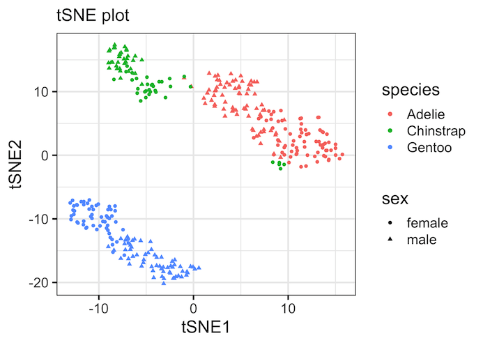
tSNE plot colored by a variable
Let us make a tSNE plot, which is a scatter plot with two tSNE components on x and y-axis. Here we have colored the data points by species and different shape for sex variable from the Penguin dataset.
tSNE_df %>%
  ggplot(aes(x = tSNE1,
             y = tSNE2,
             color = species,
             shape = sex))+
  geom_point()+
  theme(legend.position="bottom")
ggsave("tSNE_plot_example1.png")
Note that tSNE, an unsupervised dimensionality reduction technique to visualize high dimensional data has nicely captured patterns in the data. By coloring the data points by species, we can see that three Penguin species have distinct features that drive the clusters we see on the tSNE plot.
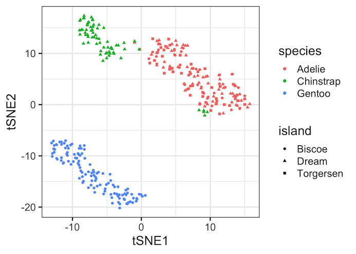
tSNE plot Example 2
Here is another example of tSNE plot, this time we have colored by species but used shape argument to island variable in the dataset.
tSNE_df %>%
  ggplot(aes(x = tSNE1,
             y = tSNE2,
             color = species,
             shape = island))+
  geom_point()
ggsave("tSNE_plot_example2.png")
Second tSNE plot example show the similarities between species and island variable. For example, Adelie Penguins are only present in Island Biscoe. The species Chinstrap seem to present in all the islands.
tSNE for identifying potential sample mismatch
One of the interesting patterns that we can see in the first tSNE plot example is that about 5 Chinstrap penguin samples (in green) seem to nicely cluster with Adelie cluster (in red).
tSNE_df %>%
  ggplot(aes(x = tSNE1,
             y = tSNE2,
             color = species,
             shape = island))+
  geom_point()+
  geom_circle(aes(x0 = 9, y0 = -2, r = 2),
              color="green",
              inherit.aes = FALSE)
Here we have annotated the five Chinstrap samples with a circle to highlight them. First tSNE plot shows that all the samples are females and second tSNE plot show that they are all the same island where there are other species as well.
And this suggests that potentially these could have been mislabeled as Chinstrap, while they actually belong to Adelie.

This could be due to other issues as well, however digging into the data a bit more does not rule out the possibility of mislabeling.
Explore the Complete ggplot2 Guide
35+ tutorials with code: scatterplots, boxplots, themes, annotations, facets, and more—tested and beginner-friendly.
Visit the ggplot2 Hub → No fluff—just code and visuals.