Last updated on August 22, 2025
Adding regression line to a scatterplot between two numerical variables is great way to see the linear trend. In this post, we will see two ways of making scatter plot with regression line using Seaborn in Python. And we will also see an example of customizing the scatter plot with regression line.
Let us load the packages we need to make scatter plot with regression line.
👉 Want more? Explore the full Seaborn Tutorial Hub with 35+ examples, code recipes, and best practices.
import seaborn as sns
import matplotlib.pyplot as plt
from vega_datasets import data
We use Seattle weather dataset available from vega_datasets.
seattle_weather = data.seattle_weather()
print(seattle_weather.head(n=3))
        date  precipitation  temp_max  temp_min  wind  weather
0 2012-01-01            0.0      12.8       5.0   4.7  drizzle
1 2012-01-02           10.9      10.6       2.8   4.5     rain
2 2012-01-03            0.8      11.7       7.2   2.3     rain
Instead of using the full dataset, we will subsample and randomly select 100 observations using Pandas sample() function.
df = seattle_weather.sample(100)
Now we are all set to make scatter plot with regression line. We will see two ways to add regression line to scatter plot.
Scatter plot with regression line: Seaborn regplot()
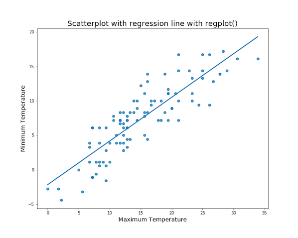
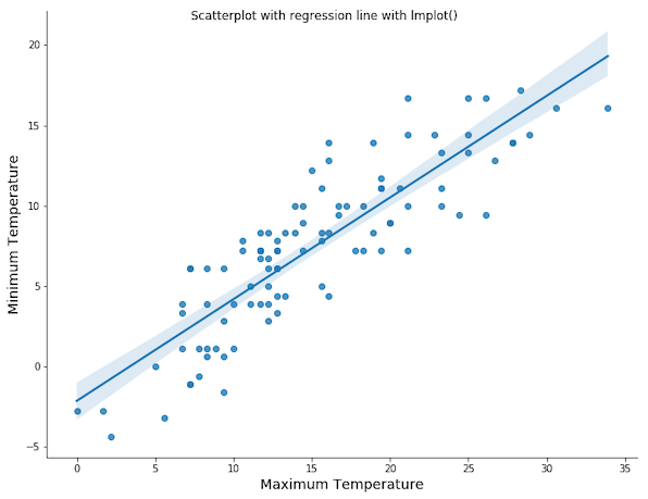
First, we can use Seaborn’s regplot() function to make scatter plot. And regplot() by default adds regression line with confidence interval.
In this example, we make scatter plot between minimum and maximum temperatures.
sns.regplot(x="temp_max",
            y="temp_min",
            data=df);
And we get a nice scatter plot with regression line with confidence interval band.

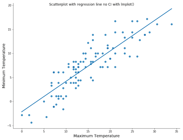
We can customize the scatterplot by removing confidence interval band. With the additional argument ci=None, we get a scatter plot with regression line, but without confidence interval band.
Scatter plot with regression line: Remove CI band Seaborn regplot()
sns.regplot(x="temp_max",
            y="temp_min",
            ci=None,
            data=df);
Scatter plot with regression line: Seaborn lmplot()
We can also use Seaborn’s lmplot() function and make a scatter plot with regression line. In this example below, we show the basic scatterplot with regression line using lmplot().
sns.lmplot(x="temp_max",
           y="temp_min",
           data=df);
Scatter plot with regression line: Remove CI band Seaborn lmplot()
sns.lmplot(x="temp_max",
           y="temp_min",
           ci=None,
           data=df);