Last updated on May 28, 2021
Principal Component Analysis (PCA) is one of the commonly used methods used for unsupervised learning. Making plots using the results from PCA is one of the best ways understand the PCA results. Earlier, we saw how to make Scree plot that shows the percent of variation explained by each Principal Component. In this post we will see how to make PCA plot i.e. scatter plot between two Principal Components. Here we will focus mainly on the first two PCs that explains most of the variations in the data.
To do PCA will use tidyverse suite of packages. We also use broom R package to turn the PCA results from prcomp() into tidy form.
library(tidyverse)
library(broom)
library(palmerpenguins)
Let us get started by removing missing values in Palmer penguin data and also remove the year variable for applying PCA.
penguins <- penguins %>%
  drop_na() %>%
  select(-year)
PCA with prcomp
We are ready to do PCA. We use select() to select numerical variables in penguins’s data, apply scale() and then do PCA with prcomp() function.
pca_fit <- penguins %>%
  select(where(is.numeric)) %>%
  scale() %>%
  prcomp()
Here is a quick summary of the PCA. We can see that the first two principal components explain 88% of the variation in the data.
summary(pca_fit)
## Importance of components:
##                           PC1    PC2     PC3     PC4
## Standard deviation     1.6569 0.8821 0.60716 0.32846
## Proportion of Variance 0.6863 0.1945 0.09216 0.02697
## Cumulative Proportion  0.6863 0.8809 0.97303 1.00000
PCA results in tidy form with broom
Our PCA results do not contain any “meta” information and the original data. We will use broom’s augment() function to add the original data to pca results.
pca_fit %>%
  augment(penguins)
broom’s augment() gives us the results in tidy form of original data and PCs.
## # A tibble: 333 x 12
##    .rownames species island bill_length_mm bill_depth_mm flipper_length_…
##    <chr>     <fct>   <fct>           <dbl>         <dbl>            <int>
##  1 1         Adelie  Torge…           39.1          18.7              181
##  2 2         Adelie  Torge…           39.5          17.4              186
##  3 3         Adelie  Torge…           40.3          18                195
##  4 4         Adelie  Torge…           36.7          19.3              193
##  5 5         Adelie  Torge…           39.3          20.6              190
##  6 6         Adelie  Torge…           38.9          17.8              181
##  7 7         Adelie  Torge…           39.2          19.6              195
##  8 8         Adelie  Torge…           41.1          17.6              182
##  9 9         Adelie  Torge…           38.6          21.2              191
## 10 10        Adelie  Torge…           34.6          21.1              198
## # … with 323 more rows, and 6 more variables: body_mass_g <int>, sex <fct>,
## #   .fittedPC1 <dbl>, .fittedPC2 <dbl>, .fittedPC3 <dbl>, .fittedPC4 <dbl>
Note the PCs are named as “.fittedPC”. Let us rename the PCs columns to PC1, PC2,…and so on.
pca_fit %>%
  augment(penguins) %>%
  rename_at(vars(starts_with(".fitted")),
            list(~str_replace(.,".fitted","")))
## # A tibble: 333 x 12
##    .rownames species island bill_length_mm bill_depth_mm flipper_length_…
##    <chr>     <fct>   <fct>           <dbl>         <dbl>            <int>
##  1 1         Adelie  Torge…           39.1          18.7              181
##  2 2         Adelie  Torge…           39.5          17.4              186
##  3 3         Adelie  Torge…           40.3          18                195
##  4 4         Adelie  Torge…           36.7          19.3              193
##  5 5         Adelie  Torge…           39.3          20.6              190
##  6 6         Adelie  Torge…           38.9          17.8              181
##  7 7         Adelie  Torge…           39.2          19.6              195
##  8 8         Adelie  Torge…           41.1          17.6              182
##  9 9         Adelie  Torge…           38.6          21.2              191
## 10 10        Adelie  Torge…           34.6          21.1              198
## # … with 323 more rows, and 6 more variables: body_mass_g <int>, sex <fct>,
## #   PC1 <dbl>, PC2 <dbl>, PC3 <dbl>, PC4 <dbl>
PCA plot: PC1 vs PC2
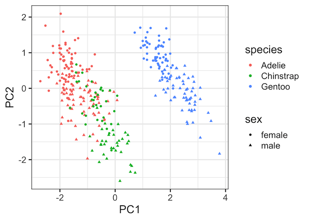
Now we have the data ready for making a PCA plot, in this example a scatter plot between the first two Principal Components. Since we have the original data handy, we can color the data points by species variable and change the shape by sex variable.
pca_fit %>%
  augment(penguins) %>%
  rename_at(vars(starts_with(".fitted")),
            list(~str_replace(.,".fitted",""))) %>%
  ggplot(aes(x=PC1,
             y=PC2,
             color=species,
             shape=sex))+
  geom_point()
This gives us the nice PCA plot showing how PC1 captured most of the variation driven by the species.
Explore the Complete ggplot2 Guide
35+ tutorials with code: scatterplots, boxplots, themes, annotations, facets, and more—tested and beginner-friendly.
Visit the ggplot2 Hub → No fluff—just code and visuals.


