Last updated on August 29, 2025
Grouped boxplots are excellent for comparing distributions across multiple categories, but they can hide important details about sample sizes and individual data points. By adding jittered points to your ggplot2 boxplot with points, you create more informative visualizations that reveal both summary statistics and the underlying data structure.
In this tutorial, you’ll master creating grouped boxplot jitter ggplot2 visualizations using geom_boxplot() and position_jitterdodge(), with advanced customization techniques for professional-quality plots perfect for research papers, presentations, and data reports.
We can make grouped boxplot without datapoints easily by using the third “grouping” variable either for color or fill argument inside aes(). However, when we try to add the layer of jittered data points on the grouped boxplot using geom_jitter(), the plot will not look good. This post shows how can we get a better grouped boxplot with jittered data points using geom_point() with position_jitterdodge() as argument.

Let us load tidyverse and palmer penguin dataset to make the grouped boxplot.
library(tidyverse)
library(palmerpenguins)
How To Make Grouped Boxplot with ggplot2?
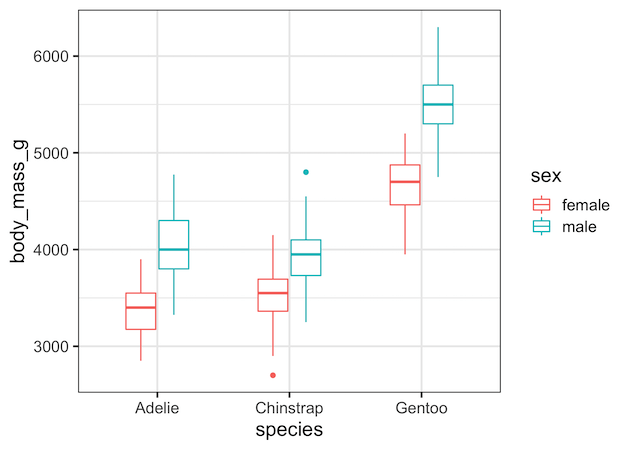
A grouped boxplot shows how a numeric variable varies across combinations of two categorical variables. In our case, body mass (y) across species (x), split by sex (group). Using colour = sex, ggplot2 creates separate box outlines for male vs female penguins inside each species category. This immediately gives us median, quartiles, and spread — but it hides how many data points are inside each box. That’s why we’ll add jittered points later.
As said earlier, we can easily make a grouped boxplot in ggplot2 using geom_boxplot() and specifying the third variable as color or fill argument. In this example, we group the boxplots by the variable sex and use color option.
penguins |>
  drop_na() |>
  ggplot(aes(x=species,y=body_mass_g, color=sex)) +
  geom_boxplot(width=.5)
How To Make Grouped Boxplot with data points using geom_jitter()?
Naively, we might try to add jittered data points to the grouped boxplot using geom_jitter() function after geom_boxplot() function. geom_jitter() function is a handy shortcut for geom_point(position=”jitter”).
penguins |>
  drop_na() |>
  ggplot(aes(x=species, y=body_mass_g, color=sex)) +
  geom_boxplot(outlier.shape=NA)+
  geom_jitter(width=0.15)
However, this makes a grouped boxplot with overlapping boxes and data points from grouping variable.
Why naive geom_jitter() overlaps
It’s natural to try adding geom_jitter() to “sprinkle” the raw data points on top of a grouped boxplot. Unfortunately, jitter does not know about the grouping variable (sex in our example). It simply shakes points left/right within the species category. The result? Male and female points overlap in the middle, creating a confusing mess.
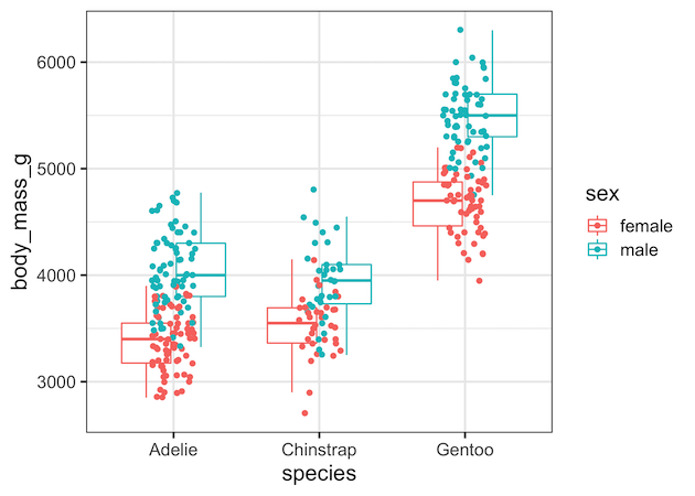
Correct approach for jittered boxplot: geom_point(position = position_jitterdodge())
To solve the overlap problem, we need both dodging (separating groups side by side) and jittering (randomly spreading points to reduce collision). ggplot2 provides exactly this with position_jitterdodge().
By passing this to geom_point(), each group (male/female) gets its own space above its boxplot, and points are gently jittered within that space. The result: raw data and summary statistics line up perfectly. This function is the secret sauce for clear grouped boxplots with points.
penguins |>
  drop_na() |>
  ggplot(aes(x=species,y=body_mass_g, color=sex)) +
  geom_boxplot(outlier.shape=NA)+
  geom_point(position=position_jitterdodge())
And we get a nice looking grouped boxplot with clearly separated boxes and jittered data within each box.

Why Do Jittered Points Shift in Grouped Boxplots (ggplot2)?
When adding jittered points on top of grouped boxplots in ggplot2, often you might notice that the points appear shifted slightly left or right of the boxes. This is not an error, but the result of how ggplot2 handles dodging and jittering. In this tutorial, we’ll explain why it happens and show how to fix it for clean, aligned plots.
Why are the jittered points not aligned with boxplots in ggplot2?
The points might look shifted. The shift happens for two main reasons. First, geom_boxplot() and geom_point() use different dodging algorithms by default: boxplots rely on position_dodge2(), while jittered points often use position_jitterdodge(). If their widths don’t match, alignment problems occur. Second, jitter itself adds random horizontal noise, so points never sit perfectly on the box centers. The combination makes points look offset, even when the grouping is correct.
ggplot(df, aes(species, body_mass_g, colour = sex)) +
  geom_boxplot(width = 0.55, outlier.shape = NA) +
  geom_point(position = position_jitterdodge(jitter.width = 0.12,
                                             dodge.width = 0.7),
alpha = 0.6, size = 1.7)position_dodge2() internally, while the points are using position_jitterdodge().Fix 1: Use the Same Dodge Width
The easiest solution is to set the same dodge.width for both the boxplot and the points. By making the dodge width explicit, ggplot2 lines up the box centers with the jittered points, eliminating the side shift. This approach ensures consistency and is the most common fix.
ggplot(df, aes(species, body_mass_g, colour = sex)) +
  geom_boxplot(width = 0.55, outlier.shape = NA,
               position = position_dodge(width = 0.7)) +
  geom_point(position = position_jitterdodge(jitter.width = 0.12,
                                             dodge.width = 0.7),
             alpha = 0.6, size = 1.7)
Fix 2: Use Fill for Boxes and Colour for Points
Another approach is to use fill for the boxplots and colour for the points, while still keeping the same dodge width. This improves clarity by giving the boxes solid fills and the points contrasting outlines. As long as both layers share the same dodge width and grouping variable, alignment is preserved.
df |>
  ggplot(aes(species, body_mass_g)) +
  geom_boxplot(aes(fill = sex),
               width = 0.55, outlier.shape = NA,
               position = position_dodge(width = 0.7)) +
  geom_point(aes(colour = sex),
             position = position_jitterdodge(jitter.width = 0.12,
                                             dodge.width = 0.7),
             alpha = 0.6, size = 1.7)
Tips for Fine-Tuning
If points still seem misaligned, try reducing jitter.width to bring them closer to the box centers, or use position_dodge2() explicitly with no padding. Always ensure the same grouping aesthetic (colour/fill) is used in both layers. A small horizontal spread is expected, since jitter is designed to separate overlapping points.
Takeaway: Jittered points look shifted in grouped boxplots because of mismatched dodging and intentional jitter. The fix is to use the same dodge width across layers and carefully control jitter width for better alignment.
Best practices & avoiding double outliers
-
Avoid double outliers: turn off boxplot outlier drawing when plotting raw points:
geom_boxplot(outlier.shape = NA). -
Consistent dodging: If you map
fill = sexin the boxplot, also mapcolour = sex(orfill) in the points so the dodge aligns. -
Show sample sizes: add counts with
dplyr::count()andgeom_text()above groups to make “n” explicit. -
Scale wisely: if distributions are wide, consider
coord_cartesian(ylim = ...)or show a log scale. - Legibility first: avoid mapping too many aesthetics (colour + fill + shape + size) on dense plots.
# show n per group
library(dplyr)
n_lab <- df |> count(species, sex)

df |>
  ggplot(aes(species, body_mass_g, colour = sex)) +
  geom_boxplot(outlier.shape = NA,
                position = position_dodge(width = 0.6)) +
  geom_point(position = position_jitterdodge(jitter.width = 0.12,
                                             dodge.width = 0.6),
             alpha = 0.6,
             size = 1.6) +
  geom_text(data = n_lab, aes(label = paste0("n=", n),
                              y = max(df$body_mass_g) + 50),
            position = position_dodge(width = 0.6),
            size = 3, show.legend = FALSE)+
  labs(title="Show n per group")
ggsave("ggplot2_grouped_boxplot_annotated_numbers.png", width=9, height =6)

FAQs
How do I add jittered points to a grouped boxplot in ggplot2?
Use geom_point(position = position_jitterdodge()). This applies both jitter and dodge so points align with the grouped boxes.
What’s the difference between geom_jitter() and position_jitterdodge()?
geom_jitter() only jitters around the category center; it doesn’t dodge by group. position_jitterdodge() both jitters and dodges so points sit above the correct box.
How do I prevent plotting outliers twice?
Disable default outlier drawing in the box layer: geom_boxplot(outlier.shape = NA) when adding raw points on top.
How can I control jitter width vs dodge width?
Set position_jitterdodge(jitter.width = 0.1–0.2, dodge.width = 0.6–0.8). Increase dodge.width as the number of groups grows.
Can I map a third variable to point shape or size?
Yes, but use sparingly for readability. Example: aes(shape = island) or aes(size = flipper_length_mm) with transparency.
Why do my points not align with the boxes?
Because the dodge mapping differs. Ensure the same aesthetic (e.g., colour = sex) is used consistently in both the boxplot and points layers.
Explore the Complete ggplot2 Guide
35+ tutorials with code: scatterplots, boxplots, themes, annotations, facets, and more—tested and beginner-friendly.
Visit the ggplot2 Hub → No fluff—just code and visuals.


