Last updated on June 18, 2021
In this post, we will learn how to draw a line connecting the mean (or median) values in a boxplot in R using ggplot2. Connecting mean or median values in each group i.e. each box in boxplot can help easily see the pattern across different groups.
The basic idea in making a boxplot with a line connecting mean values is to use ggplot2’s layering idea and build one layer on top of the other. We will first make simple boxplot and then add a layer showing mean values per group and then add a layer connecting the mean values with a line.
Boxplot with ggplot2
Let us first load tidyverse, the suite of R packages.
library(tidyverse)
theme_set(theme_bw(16))
Let us simulate some data to make a boxplot. We simulate data for five different groups with different mean and variance from normal distribution.
set.seed(2020)
df <- data.frame(grp = paste0("grp",
                             rep(1:5, each = 20),
                             sep=""),
                 values = c(rnorm(20, 5, 10),
                       rnorm(20, 20, 20),
                       rnorm(20, 60, 20),
                       rnorm(20, 50, 20),
                       rnorm(20, 30, 25)))
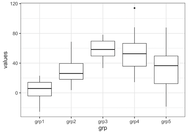
We will start with making a simple boxplot using ggplot2 using the simulated data. We can see that there are 5 groups and also the variation between them.
df %>%
  ggplot(aes(x = grp, y = values)) +
  geom_boxplot()
ggsave("simple_boxplot_ggplot2_R.png")
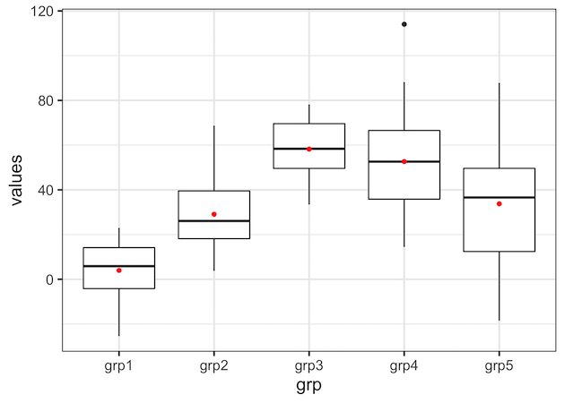
In order to add add mean or median values, we need to compute them first. Here we compute mean values per group and store the results in a dataframe.
df_mean <- df %>%
  group_by(grp) %>%
  summarize(average = mean(values)) %>%
  ungroup()
Adding Mean/Median Values as a point on Boxplot
Now we have all the data needed to make the boxplot with line connecting the mean values per group. Here we add new layer showing the mean values as point on top of the simple boxplot.
We use geom_point() function in ggplot2 in addition to geom_boxplot() function. And within geom_point() we use the dataframe containing the mean values for data and a separate aes() function with group on x-axis and average on y-axis. We also specify color to show the mean value as point.
df %>%
  ggplot(mapping = aes(x = grp, y = values)) +
  geom_boxplot() +
  geom_point(data = df_mean,
             mapping = aes(x = grp, y = average),
             color="red")
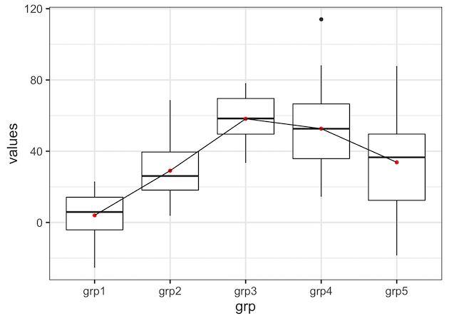
Adding a line connecting Mean/Median Values on Boxplot
Next, we can add layer corresponding to lines connecting the mean values. Using the same idea as above, we add geom_line() as another layer with dataframe containing the mean values.
df %>%
  ggplot(mapping = aes(x = grp, y = values)) +
  geom_boxplot() +
  geom_point(data = df_mean,
             mapping = aes(x = grp, y = average),
             color="red") +
  geom_line(data = df_mean,
            mapping = aes(x = grp, y = average))
Our first try to add a line connecting the mean values in boxplot results with the following error.
## geom_path: Each group consists of only one observation. Do you need to adjust
## the group aesthetic?
The reason for the error is that we did not specify which data points to be connected. In this example we want to connect all the data points and we can specify that using group=1 within aes() function inside geom_line().
df %>%
  ggplot(mapping = aes(x = grp, y = values)) +
  geom_boxplot() +
  geom_point(data = df_mean,
             mapping = aes(x = grp, y = average),
             color="red") +
  geom_line(data = df_mean,
            mapping = aes(x = grp, y = average, group=1))
ggsave("boxplot_with_line_connecting_mean_values_ggplot2_R.png")
Now we get the nice boxplot with a line connecting the mean values as we wanted. With the line connecting the mean values, one can clearly see the pattern across multiple groups.
Explore the Complete ggplot2 Guide
35+ tutorials with code: scatterplots, boxplots, themes, annotations, facets, and more—tested and beginner-friendly.
Visit the ggplot2 Hub → No fluff—just code and visuals.