![]()
Now with the new version of ggplot2 2.3.0, one can easily dodge overlapping text on x-axis. ggplot2 version 2.3.0 has a function guide_axis() to help dodge and avoid overlapping texts on x-axis label.
Let us see a couple of examples of using guide_axis() to dodge and skip overlapping texts on x-axis. Let us first make sure the new ggplot2 version is installed.
# install ggplot2 from CRAN
install.packages("ggplot2")
# verify the ggplot2 version
packageVersion("ggplot2")
We will use gapminder data set to make plots in this example. Using gapminder data, we find countries with high mean life expectancy. We first group_by() country and get mean life expectancy for each country. And then select 10 countries randomly.
set.seed(42)
df <- gapminder %>%
  group_by(country) %>%
  summarize(mean_life =mean(lifeExp)) %>%
  sample_n(10) %>%
  mutate(country=fct_reorder(country, mean_life))
Now we have the data we need to make plots.
head(df)
## # A tibble: 6 x 2
##   country   mean_life
##   <fct>         <dbl>
## 1 Ghana          52.3
## 2 Italy          74.0
## 3 Lesotho        50.0
## 4 Swaziland      49.0
## 5 Zimbabwe       52.7
## 6 Thailand       62.2
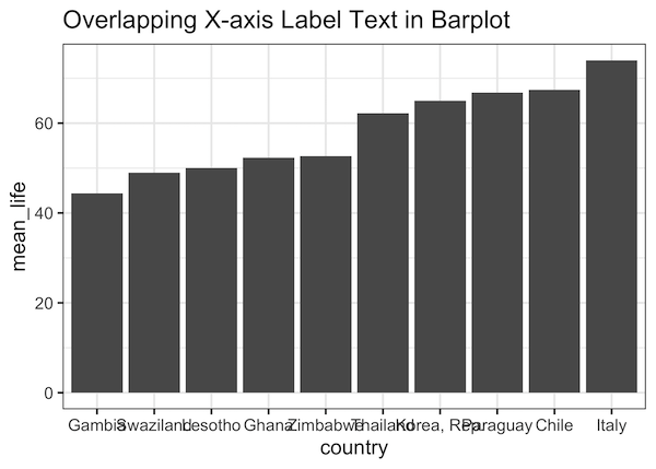
Let us make a simple barplot with country on x-axis and mean life expectancy on y-axis.
df %>%
  ggplot(aes(x=country, y=mean_life))+
  geom_col()+
  labs(title="Overlapping X-axis Label Text in Barplot")
We can see that the country names on x-axis overlap with each other and we can not easily read them.
How to Avoid Overlapping Axis Text in ggplot2?
With the latest ggplot2 version 3.3.0, we have a fix for label overlap problem. We can use guide_axis() function to dodge overlapping axis text like country names on x-axis.
We will use guide_axis() within scale_x_discrete() as shown below. We have used the argument n.dodge=3 inside guide_axis().
df %>%
  ggplot(aes(x=country, y=mean_life))+
  geom_col()+
  scale_x_discrete(guide = guide_axis(n.dodge=3))+
  labs(title="Dodge Overlapping X-axis Label Text\nwith ggplot2 3.3.0")
Now we get a nice bar plot with no overlapping x-axis text. The argument n.dodge=3 arranges every three axis labels slightly away from x-axis. Depending on the length of label names we can change n.dodge.

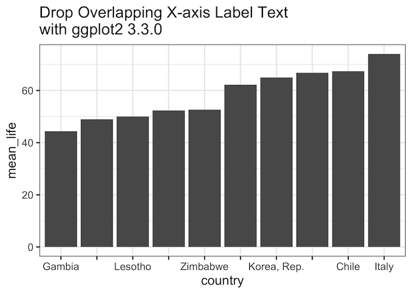
How to Drop Some Overlapping Axis Text with ggplot2?
Sometimes you may want to skip some of the intermediate text on axis. We can drop overlapping axis text using guide_axis(check.overlap = TRUE) option.
df %>%
  ggplot(aes(x=country, y=mean_life))+
  geom_col()+
  scale_x_discrete(guide = guide_axis(check.overlap = TRUE))+
  labs(title="Drop Overlapping X-axis Label Text\nwith ggplot2 3.3.0")
We can see that guide_axis(check.overlap = TRUE) option has dropped overlapping x-axis text by keeping the first and last label.