Last updated on July 22, 2020
Facetting is a great way to show relationship between more than two variables. When you have three variables, with faceting one can splot a single plot into smaller plots with subset of data corresponding to the third variable.
In ggplot2, we can easily make facetted plot using facet_wrap() function. When you use facet_wrap() in ggplot2, by default it gives a title in a grey box.
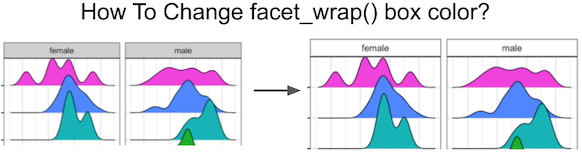
In this tutorial, we will see how to change the default grey colored facet_wrap() title box to white color. Let us load the packages needed. We will make ridgeline plot using ggridges package with facet_wrap().
library(ggridges)
library(tidyverse)
theme_set(theme_bw(16))
To illustrate customizing facet_wrap() color we will use Astronaut dataset from TidyTuesday project.
astronauts <- readr::read_csv('https://raw.githubusercontent.com/rfordatascience/tidytuesday/master/data/2020/2020-07-14/astronauts.csv')
Let us select a few countries to visualize the data using ridgeline plot.
countries <-
  astronauts %>%
  count(nationality, sort=TRUE) %>%
  head(6) %>%
  pull(nationality)
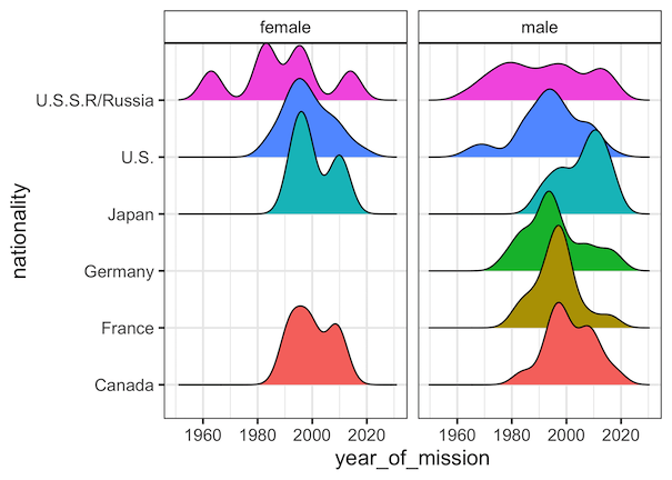
First, we will make facetted ridgeline plot with default facet_wrap color box.
astronauts %>%
  filter(nationality %in% countries) %>%
  ggplot(aes(x=year_of_mission,y=nationality, fill=nationality)) +
  geom_density_ridges()+
  theme(legend.position = "none")+
  facet_wrap(~sex)
ggsave("facet_wrap_with_default_grey_box_ggplot2.png")
We can see that the title box for each small multiple plot is in grey color.

Changing background color with strip.background
We can customize various aspects of a ggplot2 using theme() function. To change the default grey fill color in facet_wrap() title box, we need to use “strip.backgroud” argument inside theme() layer. In this example, we specify element_rect with white fill color and black for box outline color.
astronauts %>%
  filter(nationality %in% countries) %>%
  ggplot(aes(x=year_of_mission,y=nationality,
             fill=nationality)) +
  geom_density_ridges()+
  facet_wrap(~sex)+
  theme(legend.position = "none",
        strip.background = element_rect(colour="black",
                                        fill="white"))

ggsave("facet_wrap_title_box_with_white_background_ggplot2.png")
Now we have changed the default grey color box to white color box in facet_wrap().