In this post we will learn examples of adding text, annotating bars in grouped barplot using matplotlib. We will first see how to make grouped barplots using Seaborn’s barplot() function and then use Matplotlib to add annotations to the grouped bars.
The way to add annotation to grouped barplot is very similar to the way we add annotation to simple barplots‘ bars.
Let us load Pandas, Seaborn and Matplotlib.
import pandas as pd
import seaborn as sns
import matplotlib.pyplot as plt
We will use the STackOverflow survey results data to make groupbed barplots, i.e. barplots stacked side-by-side.
data_url="https://bit.ly/3aYBbhQ"
data = pd.read_csv(data_url)
print(data.head(3))
Let us clean up the data first by removing outlier developers with really low or high salaries. We also filter out developers who are managers.
data_df=data.query('Manager=="IC"')
data_df=data_df.query('CompTotal<600000 & CompTotal>30000')
Let us use the filtered data to compute mean salary for each educational category for both men and women. Pandas groupby() function followed by agg() gives us the mean values for each group.
df =data_df.groupby(['Gender', 'Education']).agg(mean_salary =("CompTotal",'mean'))
We get a multi-indexed dataframe and we convert to simple dataframe.
df =df.reset_index()
Now we have the data we need, with salary data with two group level information.
df
	Gender	Education	mean_salary
0	Man	Bachelor's	111996.874328
1	Man	Less than bachelor's	105898.614085
2	Man	Master's	128996.547692
3	Man	PhD	146498.245614
4	Man	Professional	91964.285714
5	Woman	Bachelor's	100344.609907
6	Woman	Less than bachelor's	90401.018182
7	Woman	Master's	106475.240385
8	Woman	PhD	132279.090909
9	Woman	Professional	124000.000000
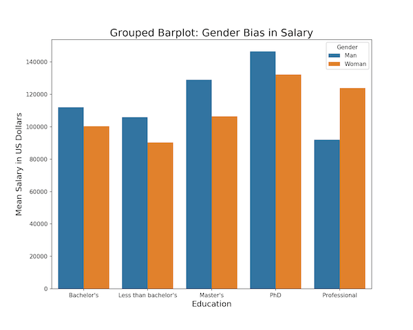
Simple Grouped Barplot: Side-by-side
Using Seaborn’s barplot() function, we can make grouped barplot with bars stacked side-by-side. Here we specify hue variable for grouping in addition to x and y-axis variables.
plt.figure(figsize=(10, 8))
sns.barplot(x="Education", y="mean_salary", hue="Gender", data=df)
plt.ylabel("Mean Salary in US Dollars", size=14)
plt.xlabel("Education", size=14)
plt.title("Grouped Barplot: Gender Bias in Salary", size=18)
We get a nice grouped barplot and Seaborn colors bars by “hue” variable argument.
First Attempt at Annotating Grouped Barplot: Side-by-side
Sometimes, it would add value to actually add text showing the height of bars in grouped barplot. To add annotation, we first need to make grouped barplot before and then use Matplotlib’s annotate function to add text for bars in grouped barplot.
The “patches” attribute in Seaborn/Matplotlib object gives us access to each bar in barplot. Here we loop through each bar, find the height of the bar, coordinate of the bar, and add text at the right place.
plt.figure(figsize=(10, 8))
splot=sns.barplot(x="Education", y="mean_salary", hue="Gender", data=df)
plt.ylabel("Mean Salary in US Dollars", size=14)
plt.xlabel("Education", size=14)
plt.title("Annotated Grouped Barplot: Gender Bias in Salary", size=18)
for p in splot.patches:
    splot.annotate(format(p.get_height(), '.0f'),
                   (p.get_x() + p.get_width() / 2., p.get_height()),
                   ha = 'center', va = 'center',
                   size=15,
                   xytext = (0, -12),
                   textcoords = 'offset points')
plt.savefig('Annotating_Bars_in_Grouped_Barplot_Seaborn_Matplotlib_try1.png',dpi=150)
Our first attempt to add text on each bar in grouped barplot has worked, with some caveats. In this example, we are adding mean salary to each bar. Since the bar width is much smaller than the length of salary text, the annotation looks weird and not that useful.

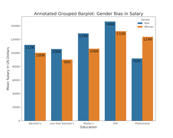
Customizing Annotation of Bars in Grouped Barplot: Side-by-side
We can customize our annotation further to make the annotation look better. Notice that we format the text that we want to add on the bar using format() function inside annotate(). We can customize the text within format(). Here first divide the salary by 1000 and round to nearest number and then add text “K” to represent the salary in thousands.
plt.figure(figsize=(10, 8))
splot=sns.barplot(x="Education", y="mean_salary", hue="Gender", data=df)
plt.ylabel("Mean Salary in US Dollars", size=14)
plt.xlabel("Education", size=14)
plt.title("Grouped Barplot: Gender Bias in Salary", size=18)
for p in splot.patches:
    splot.annotate(format(round(p.get_height()/1000), '.0f')+"K",
                   (p.get_x() + p.get_width() / 2., p.get_height()),
                   ha = 'center', va = 'center',
                   size=15,
                   xytext = (0, -12),
                   textcoords = 'offset points')
In this way, we have nicely shortened the text to fit the bar width of grouped barplot. And we get a grouped barplot with much better annotation added to each bar.
Related posts: