Last updated on June 18, 2021
In this tutorial, we will learn how to annotate or highlight a specific cluster/group in R using ggplot2. We can use R package ggforce to annotate a select group as a circle or ellipse on a scatter plot. In this example, we will use geom_mark_ellipse() function to highlight a cluster on scatterplot. To annotate specific cluster as circle, we can use geom_mark_circle() function from ggforce.
Let us get started by loading the package and data needed to make the plot.
library(tidyverse)
library(palmerpenguins)
theme_set(theme_bw(16))
Scatter plot with multiple clusters
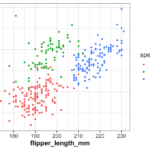
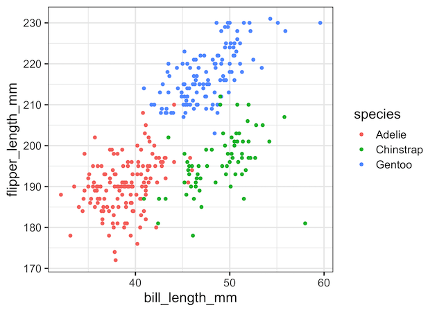
First, let make a scatterplot using ggplot2’s geom_point() after removing any missing data.
penguins <- penguins %>%
            drop_na()
# simple scatter plot colored by variable
penguins %>%
  ggplot(aes(x = bill_length_mm,
             y = flipper_length_mm))+
  geom_point(aes(color = species))
ggsave("scatterplot_with_ggplot2.png")
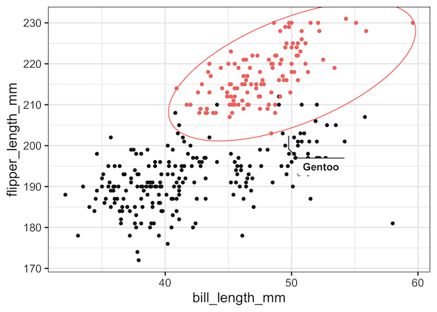
How to Annotate a Specific Cluster or Group using geom_mark_ellipse
Let us annotate specific cluster of interest using geom_mark_ellipse() function in ggforce. We will start with making the scatter plot as above. To annotate specific cluster, we will subset the data that we want to highlight and use the data to geom_mark_ellipse() function. We also color and label the group using aes() within geom_mark_ellipse() function.
penguins %>%
  ggplot(aes(x = bill_length_mm,
             y = flipper_length_mm))+
  geom_point(aes(color = species))+
  geom_mark_ellipse(data = penguins %>%
                    filter(species == "Gentoo"),
                    aes(color = species,
                        label = species),
                    expand = unit(0.5, "mm"))+
  theme(legend.position = "none")
ggsave("annotate_a_select_cluster_with_ellipse_colored_group_ggforce.png")
In this example, we have annotated one group with ellipse, but also have colored other groups in the plot.

How to Annotate and Add Color to a Specific Cluster
Sometimes we might want the group of interest to standout by coloring only that group. We can do that by adding two geom_point() layers. One with all the data points, but no color. And the second geom_point() layer with data containing the group of interest, but with aes() function to color the group.
penguins %>%
  ggplot(aes(x = bill_length_mm,
             y = flipper_length_mm))+
  geom_point()+
  geom_mark_ellipse(data = penguins %>%
                    filter(species=="Gentoo"),
                    aes(color = species,
                        label = species),
                    expand = unit(0.5, "mm"))+
  geom_point(data = penguins %>%
                    filter(species == "Gentoo"),
             aes(color = species))+
  theme(legend.position = "none")
ggsave("annotate_select_cluster_highlighted_with_ellipse_ggforce.png")
You might also be interested in How To Annotate Clusters with Circle/Ellipse by a Variable in R
Explore the Complete ggplot2 Guide
35+ tutorials with code: scatterplots, boxplots, themes, annotations, facets, and more—tested and beginner-friendly.
Visit the ggplot2 Hub → No fluff—just code and visuals.