In this post, we will learn how to adjust positions of x-axis and y-axis labels in Matplotlib in Python. By default, plots with matplotlib places the axis labels in the middle. With matplotlib version 3.3.0, the matplotlib functions set_xlabel and set_ylabel have a new parameter “loc” that can help adjust the positions of axis labels.
For the x-axis label, it supports the values ‘left’, ‘center’, or ‘right’ to place the label towards left/center/right. Similarly, for the y-axis label, it supports the values ‘bottom’, ‘center’, or ‘top’.
Let us get started by loading the libraries needed. Here we need Matplotlib version 3.3. and above to change the position of axis labels.
import matplotlib.pyplot as plt
import numpy as np
We will simulate some data to make a simple histogram using Numpy’s random module
.
# set seed for reproducing
np.random.seed(42)
n = 5000
mean_mu1 = 60
sd_sigma1 = 15
data = np.random.normal(mean_mu1, sd_sigma1, n)
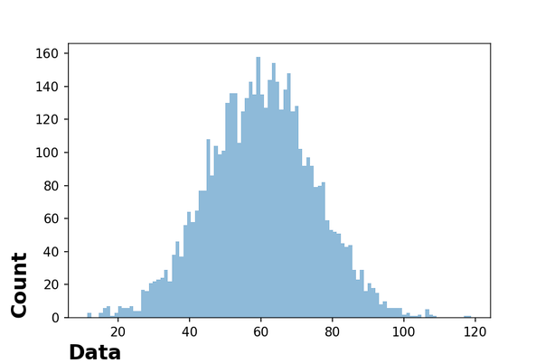
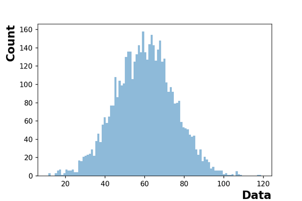
We have the data ready to make a plot with matplotlib with default options. We make a histogram and use set_xlabel and set_ylabel to adjust the axes labels’ font size, weigth and text. This helps us make the histogram with clearly legible labels on both x and y-axes.
fig, ax = plt.subplots()
ax.hist(data, bins=100, alpha=0.5,
       density=False)
ax.set_xlabel("Data",
             fontweight ='bold',
             fontsize=16)
ax.set_ylabel("Count",
               fontweight ='bold',
               fontsize=16)
We can see that by default, matplotlib places the axes label text in the middle of the axes lines.
How to Change Axes Label Positions with “loc”?
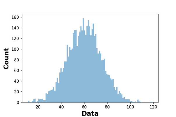
Let us see an example on how to use set_xlabel and set_ylabel with loc parameter to adjust the positions of axis labels. In the example below, we place x-axis label towards right side and the y-label on top.
fig, ax = plt.subplots()
ax.hist(data,bins=100, alpha=0.5,
             density=False)
ax.set_xlabel("Data",
              fontweight ='bold',
              fontsize=16,
              loc="right")
ax.set_ylabel("Count",
              fontweight ='bold',
              fontsize=16,
              loc="top")
Here is another example of placing the axes labels using loc parameter in set_xlabel and set_ylabel functions. In the example below, we place x-axis label towards left side and the y-label at the bottom.
fig, ax = plt.subplots()
ax.hist(data, bins=100, alpha=0.5,
        density=False)
ax.set_xlabel("Data",
               fontweight ='bold',
               fontsize=16,
               loc="left")
ax.set_ylabel("Count",
               fontweight ='bold',
               fontsize=16,
               loc="bottom")