Last updated on September 25, 2020
Boxplots are a great way to visualize multiple distributions using summary statistics. Boxplot shows five summary statistics; the minimum, the maximum, the median, and the first and third quartiles of the data. Sometimes, you might want to add other statistical summary values on the boxplot.
In this post, we will see how to show mean value on a boxplot made with ggplot2 in R. We will use gapminder data make boxplots and add mean values to each box in the boxplot.
Let us load tidyverse suite of packages.
library(tidyverse)
library(gapminder)
Let us first make a simple boxplot using gapminder data with continent on x-axis and lifeExp values on y-axis.
gapminder %>%
  ggplot(aes(continent,lifeExp, fill=continent)) +
  geom_boxplot() +
  theme(legend.position = "none")
We get a simple boxplot with colors filled by continent variable.

Add Mean Values to Boxplot with stat_summary()
Let us add mean values of lifeExp for each continent in the boxplot. In ggplot2, we can use stat_summary() function to cmpute new summary statistics and add it to the plot. In this example, we compute mean value of y-axis using fun.y argument in stat_summary() function.
gapminder %>%
  ggplot(aes(continent,lifeExp, fill=continent)) +
  geom_boxplot() +
  stat_summary(fun.y="mean")+
  theme(legend.position = "none")
We get a boxplot with black filled circle showing the mean values of lifeExp in each box.

ggplot2
Customize Mean Values to Boxplot in ggplot2
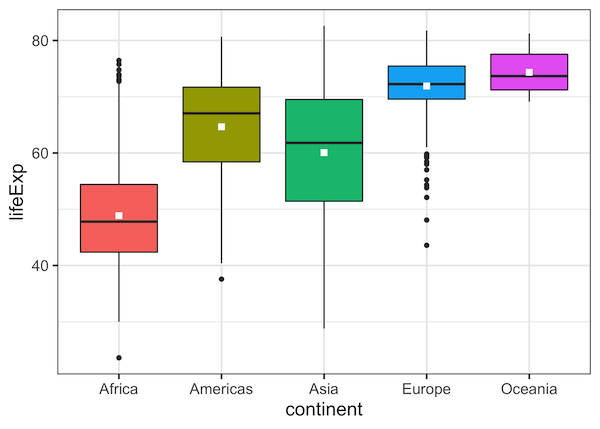
We can change color of the mean mark and customize further using multiple options within stat_summary() function. In this example, we change the color and change the shape for the symbol used to show mean values.
gapminder %>%
  ggplot(aes(continent,lifeExp, fill=continent)) +
  geom_boxplot() +
  stat_summary(fun.y="mean", color="white", shape=15)+
  theme(legend.position = "none")
We can see that, now we get boxplot with mean values highlighted by white squares in each box.
Explore the Complete ggplot2 Guide
35+ tutorials with code: scatterplots, boxplots, themes, annotations, facets, and more—tested and beginner-friendly.
Visit the ggplot2 Hub → No fluff—just code and visuals.