In this post, we will see how to add labels or annotations to select data points such that the labels don’t overlap with each other. We will use the R package ggrepel together with ggplot to add labels without overlaps. More specifically we will use geom_text_repel() function from ggrepel to add annotations to data points.
Let us load tidyverse and ggrepel to highlight a select points with ggrepel. We will also set a ggplot2 theme
library(tidyverse)
library(ggrepel)
theme_set(theme_bw(16))
Here, we will use the Palmer Penguins dataset to make a plot annotating a select data with ggrepel.
p2data <- "https://raw.githubusercontent.com/datavizpyr/data/master/palmer_penguin_species.tsv"
penguins_df <- read_tsv(p2data)
## Parsed with column specification:
## cols(
##   species = col_character(),
##   island = col_character(),
##   culmen_length_mm = col_double(),
##   culmen_depth_mm = col_double(),
##   flipper_length_mm = col_double(),
##   body_mass_g = col_double(),
##   sex = col_character()
## )
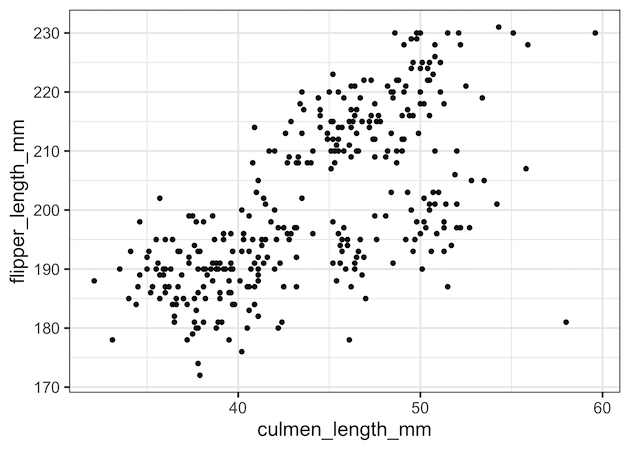
Let us first make a simple scatter plot with penguins data set. On the x-axis we have culmen length and on the y-axis we have flipper length.
penguins_df %>%
  ggplot(aes(x=culmen_length_mm, y=flipper_length_mm))+
  geom_point()
Out scatter plot looks like this.
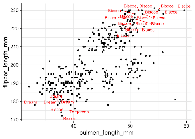
Let us say we want to annotate the data points that are on the extreme ends of diagonal in the scatter plot. One of the ways to do that is to subset the original dataframe in to a smaller dataframe satisfying the conditions for adding annotations. Here we subset penguins dataframe such that we have the extreme datapoints on the diagnonal in the smaller dataframe.
create data
df <-  penguins_df %>%
  filter((culmen_length_mm > 50 & flipper_length_mm >220) |
          (culmen_length_mm < 45 & flipper_length_mm <180) )
We are all set to make the plot with labels for select data points. As shown in the simple scatterplot example above, we first make a scatter plot.
And then we add geom_text_repel() function with the smaller dataframe as its data and the same x and y-axis inside aes(). We also specify which variable we want to add as annotation or label using the argument “label”. We have also specified red color for the text labels.
We start as
penguins_df %>%
  ggplot(aes(x=culmen_length_mm, y=flipper_length_mm))+
  geom_point()+
  geom_text_repel(data=df,
                  aes(x=culmen_length_mm,
                      y=flipper_length_mm,
                      label=island),
                  color="red")
Now we have scatter plot with non-overlapping labels for select data point using ggrepel..