Last updated on June 11, 2021
In this tutorial, we will learn how to add circles/triangles around a select data points in a scatter plot made with ggplot2 in R. Adding circles/triangles around data points is yet another way to add annotation to data points to highlight them to attract attention to the region of the plot.
Let us load tidyverse and palmer penguins data package. We will also set the ggplot2’s theme to theme_bw().
library(tidyverse)
library(palmerpenguins)
theme_set(theme_bw(16))
penguins %>%
  head()
## # A tibble: 6 x 8
##   species island bill_length_mm bill_depth_mm flipper_length_… body_mass_g sex
##   <fct>   <fct>           <dbl>         <dbl>            <int>       <int> <fct>
## 1 Adelie  Torge…           39.1          18.7              181        3750 male
## 2 Adelie  Torge…           39.5          17.4              186        3800 fema…
## 3 Adelie  Torge…           40.3          18                195        3250 fema…
## 4 Adelie  Torge…           NA            NA                 NA          NA <NA>
## 5 Adelie  Torge…           36.7          19.3              193        3450 fema…
## 6 Adelie  Torge…           39.3          20.6              190        3650 male
## # … with 1 more variable: year <int>
Simple Scatter Plot with ggplot2
First, let us make a simple scatter plot with geom_point() in ggplot2.
penguins %>%
  ggplot(aes(x=bill_length_mm, flipper_length_mm))+
  geom_point()
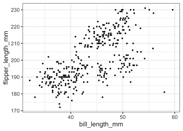
We can see some data points are outliers in the above scatter plot and let us add circles around the points to highlight.
Add Circles Around Select Data Points
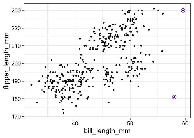
To add circles around select data points, we will use another layer of genom_point() with subset of data for adding circles. Instead of simple points, we will use pch value for hollow circle shaped points. We made the circle bigger with size and specified a color with colour argument.
penguins %>%
  ggplot(aes(x=bill_length_mm, flipper_length_mm))+
  geom_point()+
  geom_point(data=penguins %>% filter(bill_length_mm > 56),
             pch=21,
             size=4,
             colour="purple")
ggsave("Add_circles_around_select_data_points_ggplot2.png")
Now we have highlighted a few extreme data points with purple circles.
Add Triangles Around Select Data Points
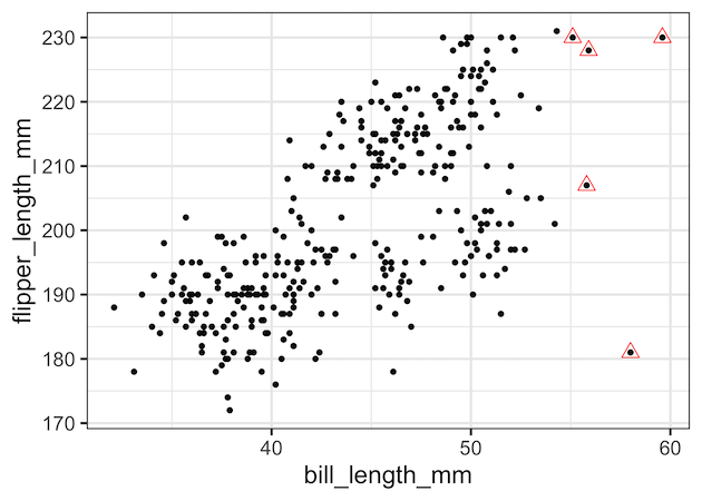
By using different value for pch we can choose to add different shape. Here, we use pch= 24 to add triangles around select data points.
penguins %>%
  ggplot(aes(x = bill_length_mm, y = flipper_length_mm)) +
  geom_point() +
  geom_point(data=penguins %>%
             filter(bill_length_mm > 55),
             pch = 24,
             size=4,
             colour = "red")
Add Circles and Traingles Around Data Points
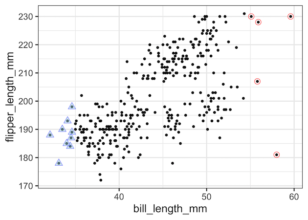
We can also add multiple shapes to different set of data points using additional geom_point() layers. In this example, we added both circles and triangles around select data points. Here we also filled triangles with colors.
penguins %>%
  ggplot(aes(x = bill_length_mm, y = flipper_length_mm))+
  geom_point()+
  geom_point(data = penguins %>%
               filter(bill_length_mm > 55),
             pch=21,
             size=4,
             colour="red") +
    geom_point(data=penguins %>%
                 filter(bill_length_mm < 35),
             pch=24,
             fill="lightblue",
             alpha=0.5,
             size=4, colour="blue")
Explore the Complete ggplot2 Guide
35+ tutorials with code: scatterplots, boxplots, themes, annotations, facets, and more—tested and beginner-friendly.
Visit the ggplot2 Hub → No fluff—just code and visuals.


