Last updated on August 22, 2025
In this tutorial, we will learn how to add mean or median vertical line to a plot made with Seaborn’s displot() function. Seaborn’s displot() offers capability to visualize the univariate or bivariate distribution of data. Here we will make a histogram with Seaborn’s displot() and then see how to add median line to the histogram,
Let us load the libraries needed.
import seaborn as sns
import pandas as pd
import matplotlib.pyplot as plt
👉 Want more? Explore the full Seaborn Tutorial Hub with 35+ examples, code recipes, and best practices.
Histogram with Seaborn’s displot()
We will using penguins data available from seaborn to make histogram with displot (not distplot) function.
penguins = sns.load_dataset("penguins")
sns.displot(penguins,
            x = "flipper_length_mm",
            bins=30,
            height=8)
plt.xlabel("Flipper Length", size=14)
plt.ylabel("Count", size=14)
plt.savefig("Seaborn_displot_histogram_Python.png")

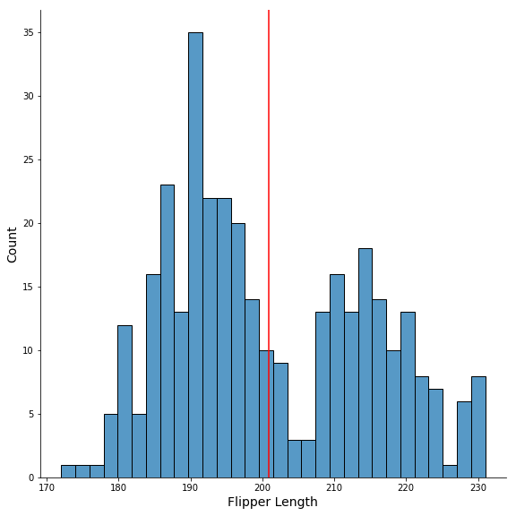
Add Mean line to Histogram with axvline()
We will use Matplotlib’s axvline() function to add mean line to the histogram made with Seaborn’s displot(). We also specify color argument to make the mean line in red color.
sns.displot(penguins,
            x = "flipper_length_mm",
            bins=30,
           height=8)
plt.xlabel("Flipper Length", size=14)
plt.ylabel("Count", size=14)
plt.axvline(x=penguins.flipper_length_mm.mean(),
            color='red')
plt.savefig("Seaborn_displot_histogram_with_mean_line_Python.png")
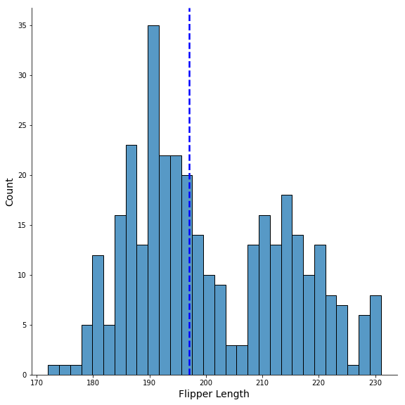
Customizing Mean line to Histogram with axvline()
To further customize the mean/median line to the histogram we use line type with “ls” and line width using “lw” to make a thicker dotted median line.
sns.displot(penguins,
            x = "flipper_length_mm",
            bins=30,
           height=8)
plt.xlabel("Flipper Length", size=14)
plt.ylabel("Count", size=14)
plt.axvline(x=penguins.flipper_length_mm.median(),
            color='blue',
            ls='--',
            lw=2.5)
plt.savefig("Seaborn_displot_histogram_with_median_line_Python.png")