Last updated on August 1, 2021
Horizontal boxplots cane be very useful, when you have categories with longer names. In general, Boxplots are great visualization tool for looking at multiple distributions at the same time, However, when the description of each distribution on x-axis is bit longer, it may become really difficult to understand the boxplot. One of the solutions is to flip the co-oordinates and make the horizontal boxplots.
Although horizontal boxplot may need some time to get adjusted if you have not seen before, it can make the boxplot greatly legible.
In this post we will examples of making horizontal boxplots using simulated data.
import seaborn as sns
import matplotlib.pyplot as plt
import pandas as pd
import numpy as np
Simulate Data for making Boxplots
Let us simulate a dataframe containing 9 countries and their life expectancy value distributions. We create numpy arrays using NumPy’s random module for each country and create a dictionary with the country name. And then make pandas dataframe with dictionary as input.
np.random.seed(42)
# Generating Data
df = pd.DataFrame({
    'Sierra Leone': np.random.normal(37, 10, 100),
    'Somalia': np.random.normal(41, 15,100),
    'Morocco': np.random.normal(57, 5,100),
    'China': np.random.normal(61, 10,100),
    'Mexico': np.random.normal(65, 10,100),
    'Jamaica': np.random.normal(68, 8,100),
    'Taiwan': np.random.normal(68, 8,100),
    'USA': np.random.normal(73, 5, 100),
    'Iceland': np.random.normal(76, 5, 100)
})
Here is the data we simulated.
print(df.head(n=3))

  Sierra Leone    Somalia    Morocco      China     Mexico    Jamaica  \
0     41.967142  19.769439  58.788937  52.710050  49.055723  75.409420
1     35.617357  34.690320  59.803923  55.398190  59.006250  83.275333
2     43.476885  35.859282  62.415256  68.472936  65.052437  56.811459

      Taiwan        USA    Iceland
0  74.055909  70.386385  80.691419
1  60.622677  78.245046  73.419776
2  74.956847  69.478282  76.480604
Seaborn’s boxplot function can take input in wide form for (with a specific form) and long form. We can clearly see that the data is in wide form. Let us manually convert the data to long form. We can tidy our data and convert to long form using Pandas’ melt function.
# melt dataframe to convert the data long form
df_long = df.melt(var_name='country',value_name='lifeExp')
Now the data is in long form with two columns, one for country names and the other for lifeExp values.
print(data_df.head())

        country    lifeExp
0  Sierra Leone  41.967142
1  Sierra Leone  35.617357
2  Sierra Leone  43.476885
3  Sierra Leone  52.230299
4  Sierra Leone  34.658466
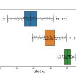
Simple Boxplot in Python with Seaborn
Let us make a simple boxplot with country on x-axis using the data in long form using Seaborn’s boxplot function.
We would specify country on x-axis.
# simple boxplot python
sns.boxplot(x = "country",
            y = "lifeExp",
           data = df_long)
We can see that our boxplot looks nice, but the x-axis labels are overlapping on each other and not legible at all.

It would be nice to make the labels legible again. One approach is to write the labels in an angle. However, that would distort the plot size and not a good idea.
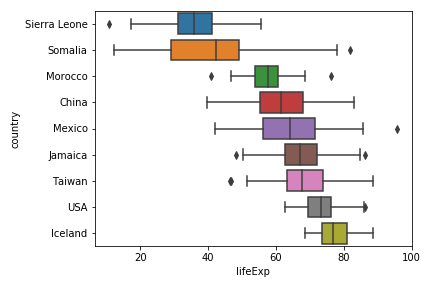
Horizontal Boxplot in Python with Seaborn
A better alternative is to flip the co-ordinates and make horizontal boxplots. With Seaborn, it is easy to make horizontal boxplot. All we need to do is to specify the categorical variable on y-axis and the numerical variable on x-axis, i.e. flip the x and y-axis variables.
# horizontal boxplot in python
sns.boxplot(y = "country",
            x = "lifeExp",
           data = df_long)
plt.tight_layout()
Our boxplot is flipped now and it is a horizontal boxplot. The y-axis labels representing the countries are clearly legible as we wanted. And we can also see the trend in boxplot nicely.