Last updated on May 9, 2021
In this tutorial, we will see how to make a histogram with a density line using Seaborn in Python. With Seaborn version 0.11.0, we have a new function histplot() to make histograms.
Here, we will learn how to use Seaborn’s histplot() to make a histogram with density line first and then see how how to make multiple overlapping histograms with density lines.
Let us first load the packages needed.
import matplotlib.pyplot as plt
import pandas as pd
import seaborn as sns
And let us make sure the Seaborn version is at least 0.11.0
print(sns._version__)
'0.11.0'
To make histograms with density lines, we will use the Penguins data set.
penguins_data="https://raw.githubusercontent.com/datavizpyr/data/master/palmer_penguin_species.tsv"
Our github page has the penguin data file and let us load the data directly from it.
penguins_df = pd.read_csv(penguins_data, sep="\t")
penguins_df.head()
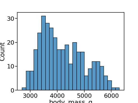
Simple Histogram with Seaborn histplot()
plt.figure(figsize=(8,6))
sns.histplot(x= "body_mass_g",
             data=penguins_df,
             bins=25)
plt.savefig("Basic_Histogram_with_Seaborn_histplot.jpg")
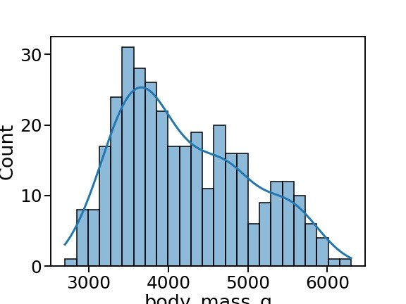
How to Make Histogram with Density line using Seaborn histplot()
With Seaborn histplot(), we can make histogram showing the distribution of a numerical variable. To add density line on top of the histogram, we can use “kde=True”.
plt.figure(figsize=(8,6))
sns.histplot(x= "body_mass_g",
             data=penguins_df,
             bins=25,
             kde=True,
             line_kws={"linewidth":3})
plt.savefig("Histogram_with_Density_line_Seaborn_histplot.jpg")
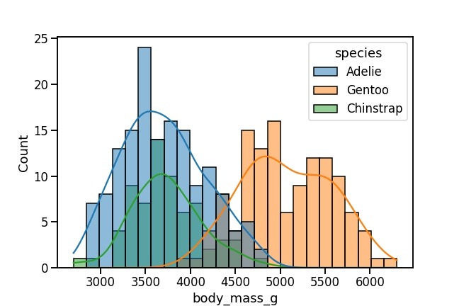
How to Make Overlapping Histograms with Density lines using Seaborn histplot()
We can make overlapping histograms for a numerical variable, by specifying the grouping variable as “hue”. This will create multiple overlapping histograms with different colors. And we can density lines for each grouped historgram using “kde=True” as before.
plt.figure(figsize=(9,6))
sns.histplot(x= "body_mass_g",
             data=penguins_df,
              bins=25,
              hue="species",
              kde=True)
plt.savefig("Histograms_with_Multiple_Density_lines_Seaborn_histplot.jpg")