Seaborn, one of the Python data visualisation libraries had a huge update with Seaborn version 0.12.0 in September 2022. A really exciting development is new API for grammar of graphics like ggplot2.
The introduction of seaborn.objects interface is the new API
Taking inspiration from Wilkinson’s grammar of graphics — and its implementation in libraries such as ggplot2 and vega-lite — the objects interface offers a collection of classes that can be flexibly combined to specify a wide range of statistical graphics.
In this tutorial, we will use the new Seaborn API to learn how to make histograms. We will start with the simple histogram first and the do multiple customization step-by-step.
Let us get started by loading the packages needed. Note that we are loading Seaborn objects separately in addition Seaborn. We also check the version of Seaborn.
import seaborn as sns
sns.__version__
import seaborn.objects as so
import pandas as pd
import matplotlib.pyplot as plt

0.12.0
We will use the built-in health expenditure dataset in Seaborn to make the histograms.
healthexp = sns.load_dataset("healthexp")
healthexp.head()

	Year	Country	Spending_USD	Life_Expectancy
0	1970	Germany	252.311	70.6
1	1970	France	192.143	72.2
2	1970	Great Britain	123.993	71.9
3	1970	Japan	150.437	72.0
4	1970	USA	326.961	70.9
Simple Histograms with Seaborn objects
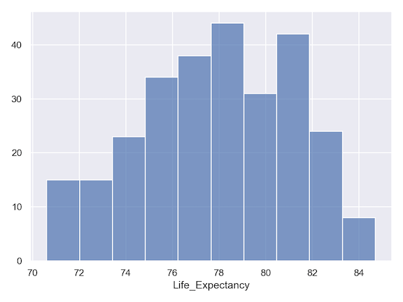
The main function in Seaborn objects to make a plot is to use Plot() function. Plot() function specifies the main plot layer. Then to make a histogram we use add() function on top of Plot() function. Within add() function we use Bars() and Hist() to specify we are making histogram.
(
    so.Plot(healthexp,
            x = "Life_Expectancy")
    .add(so.Bars(), so.Hist())
    .save("Seaborn_histogram_grammar_of_graphics_API.png",
           format='png',
           dpi=150)
)
Note that we have save the plot as png file using save() function instead of the matplotlib way to save. a plot as file.
Changing the Seaborn plot’s theme with Seaborn objects
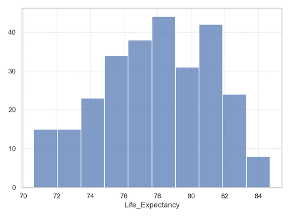
By default, Seaborn makes the plot. in grey background. We can change the background theme of a plot in Seaborn object using theme() function. And the theme function takes dictionary as argument with key value pair from Matplotlib style.
from seaborn import axes_style
(
    so.Plot(healthexp,
            x = "Life_Expectancy")
    .add(so.Bars(), so.Hist())
    .theme({**axes_style("whitegrid"), "grid.linestyle": ":"})
    .save("Seaborn_histogram_white_theme_grammar_of_graphics_API.png",
           format='png',
           dpi=150)
)
Now our plot is on white grid instead of grey.
Changing the number of bins in histogram
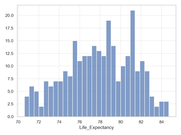
We can change the number of bins for making the histogram with bins argument to Hist() function.
(
    so.Plot(healthexp,
            x = "Life_Expectancy")
    .add(so.Bars(), so.Hist(bins=30))
    .theme({**axes_style("whitegrid"), "grid.linestyle": ":"})
    .save("Seaborn_histogram_binsize_grammar_of_graphics_API.png",
           format='png',
           dpi=150)
)
Facetting histograms with Seaborn objects
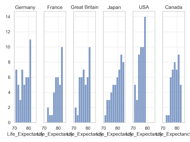
To make small multiples, i.e. facet with respect to a variable, we can use facet() function with the variable as additional layer to the histogram we made earlier. In this example we facet by Country.
(
    so.Plot(healthexp,
            x = "Life_Expectancy")
    .add(so.Bars(), so.Hist())
    .facet("Country")
    .theme({**axes_style("whitegrid"), "grid.linestyle": ":"})
    .save("Seaborn_histogram_facetting_grammar_of_graphics_API.png",
           format='png',
           dpi=150)
)
Customizing facets with Seaborn objects
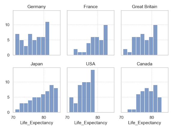
The facetted histogram has 6 plots in the same row making it difficult to see the pattern. A better approach is to specify the number of plots in a row. With “wrap” argument to facet() function we can specify the number of plots in a row. In the example below, we have three plots in a row using “wrap=3”.
(
    so.Plot(healthexp,
            x = "Life_Expectancy")
    .add(so.Bars(), so.Hist())
    .facet("Country", wrap=3)
    .theme({**axes_style("whitegrid"), "grid.linestyle": ":"})
    .save("Seaborn_histogram_facetting_wrap_grammar_of_graphics_API.png",
           format='png',
           dpi=150)
)
