Last updated on April 26, 2020
Bar charts are a simple visualization that plots a quantitative variable corresponding to categorical variable as bars. Sometimes we might want to highlight a specific bar in barplot with different color compared to the rest. In this post, we will see examples of
* How to Make a simple barplot or barchart with Altair?
* How to highlight a bar in bar chart with a different color using Altair?
import seaborn as sns
import matplotlib.pyplot as plt
import pandas as pd
We will use gapminder data to make barchart with Altair. Instead of using all of gapminder data, we will subset the data corresponding to Americas.
data_url = 'http://bit.ly/2cLzoxH'
gapminder = pd.read_csv(data_url)
gapminder=gapminder.query("continent=='Americas'")
Let us compute average lifeExp for each country in Americas. To do that we will first, group by country and select lifeExp variable to compute mean values.
df =gapminder.groupby("country")[['lifeExp']].mean()
We will convert the rownames into a column in the data frame using reset_index().
df.reset_index(inplace=True)
Now we have the dataframe needed to make barchart.
df.head()
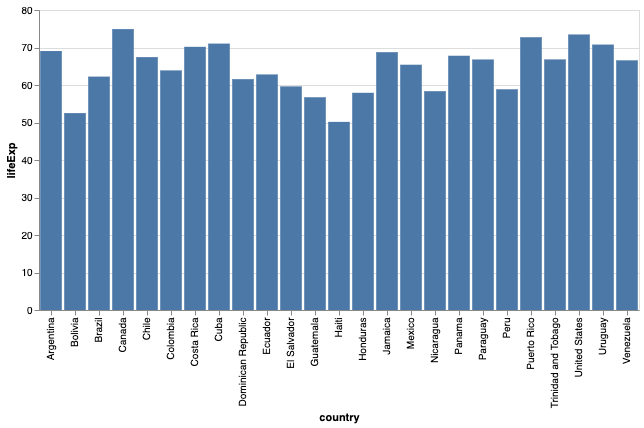
Simple Bar Chart with Altair
First, let us use Altair to make a simple bar chart. We can make barchart in Altair using mark_bar() function.
alt.Chart(df).mark_bar().encode(
    x='country:O',
    y="lifeExp:Q",
).properties(width=600)
By default, we get a barplot with the bars colored in a nice “steelblue” color.
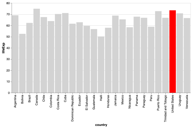
How to Highlight a bar with different Color in Altair?
In order to highlight a specific bar or bars in different color, we need to use alt.Condition function. This function lets us create a conditional and assign different colors based on the condition.
Here, we check for country values and if it is “United States”, we are assigning red color and light grey color otherwise.
alt.Chart(df).mark_bar().encode(
    x='country:O',
    y="lifeExp:Q",
    # We will use the following condition to
    # highlight a bar
    color=alt.condition(
        alt.datum.country == 'United States',  # If the country is "US" this test returns True,
        alt.value('red'),     # highlight a bar with red.
        alt.value('lightgrey')   # And grey for the rest of the bars
     )
).properties(width=600)
Now get a nice barplot highlighting one bar with different color than the rest. In this example, we highlight a single bar of the barplot. However, we can use the same technique to highlight multiple bars as well.