Last updated on March 14, 2020
In this post, we will learn how to make hierarchically clustered heatmap in Python. We will use Saeborn’s Clustermap function to make a heat map with hierarchical clusters. Seaborn’s Clustermap is very versatile function, but we will showcase the use of the function with just one example.
Let us load Pandas, Seaborn and matplotlib.pyplot to make the clustered heatmap.
import pandas as pd
import seaborn as sns
import matplotlib.pyplot as plt
We will use the breast cancer data from Scikit Learn’s datasets. Let us load the data sets from sklearn.datasets. It contains quantitative data with features regarding breast cancer.
from sklearn.datasets import load_breast_cancer
bc_data = load_breast_cancer()
Let us store the data as Pandas datadrame. We will also add the target feature of the data corresponding to whether sample is benign or cancer.
data = pd.DataFrame(bc_data.data, columns=bc_data.feature_names)
data['target']=bc_data.target
data.iloc[0:3,0:3]
	mean radius	mean texture	mean perimeter
0	17.99	10.38	122.8
1	20.57	17.77	132.9
2	19.69	21.25	130.0
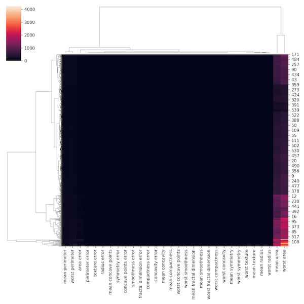
We now have the data ready to make heatmap with Seaborn’s clustermap. Let us try to make hierarchically clustered heatmap.
sns.clustermap(data)
plt.savefig('hierarchical_clustered_heatmap_with_Seaborn_clustermap_python_1st_try.png',dpi=150)
The clustered heatmap we got looks really bad. Let us dissect what went wrong and improve.
By default, Seaborn’s clustermap uses distance metric to make heatmap. Let us change the metric to correlation by using metric=”correlation.
sns.clustermap(data, metric="correlation")
plt.savefig('hierarchical_clustered_corr_heatmap_with_Seaborn_clustermap_python_2nd_try.png',dpi=150)
We seem to have not made any improvement with the metric choice.

If we take a look at that data, our features are different scale. Let us standardise the column features using “standard_scale=1” and make the heatmap.
sns.clustermap(data,
               metric="correlation",
               standard_scale=1)
plt.savefig('hierarchical_clustered_scaled_heatmap_with_Seaborn_clustermap_python_3rd_try.png',dpi=150)
Out third try at making clustered heatmap after transforming each feature on the same scale has helped greatly and our clustered heatmap looks much better.

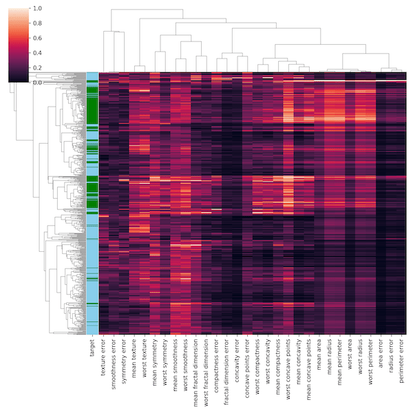
In the breast cancer data, we also have group identity, if the same is benign or cancer. Let us add that to our heatmap. The basic idea is to assign color each group and add a column with that color.
Let us first create a color dictionary mapping group to a color. And then use Pandas ability to create a new variable with the dictionary using map function. This creates a new color variable using the dictionary and the disease group variable.
color_dict=dict(zip(np.unique(bc_data.target),np.array(['g','skyblue'])))
target_df = pd.DataFrame({"target":bc_data.target})
row_colors = target_df.target.map(color_dict)
Now we can feed that color variable to the argument row_colors in Seaborn’s clustermap function.
sns.clustermap(data,
               metric="correlation",
               standard_scale=1,
               row_colors=row_colors)
plt.savefig('hierarchical_clustered_heatmap_with_Seaborn_clustermap_python.png',dpi=150)
This gives us clustered heatmap with column for target, i.e. the group level information for each sample, We can see that some of the members of the group nicely clusters together, while the others don’t with our chosen clustering metric.

Let us remove the tick labels on the y-axis using yticklabels=False.
sns.clustermap(data,
               metric="correlation",
               standard_scale=1,
               row_colors=row_colors,
               yticklabels=False)
plt.savefig('hierarchical_clustered_heatmap_2_with_Seaborn_clustermap_python.png',dpi=150)