Heatmaps visualizes multi-dimensional data as a matrix filled with colors based on their numerical value. For example the portion of matrix with low values will have one color and the portion with high values will have another color. This can help us identify the pattern in the data easily.
In this post we will examples of making a quick heatmap using ggplot2 in R.
ggplot2 has two geoms, geom_tile() and geom_raster(), that can help up make simple heatmaps quickly.
In our first example, we will use gapminder which already in long tidy form to make heatmap using either geom_tile() or geom_raster().
Let us first load tidyverse and gaominder data
library(tidyverse)
library(gapminder)
We will be using lifeExp and gdpPercap data and its change over time to make heatmap with ggplot2.
head(gapminder)

## # A tibble: 6 x 6
##   country     continent  year lifeExp      pop gdpPercap
##   <fct>       <fct>     <int>   <dbl>    <int>     <dbl>
## 1 Afghanistan Asia       1952    28.8  8425333      779.
## 2 Afghanistan Asia       1957    30.3  9240934      821.
## 3 Afghanistan Asia       1962    32.0 10267083      853.
## 4 Afghanistan Asia       1967    34.0 11537966      836.
## 5 Afghanistan Asia       1972    36.1 13079460      740.
## 6 Afghanistan Asia       1977    38.4 14880372      786.
Let us subset the gapminder data to contain data from African countries and use the smaller data to make our heatmap with ggplot2.
df1 <- gapminder %>%
  filter(continent %in% c("Africa")) %>%
  mutate(year=factor(year))
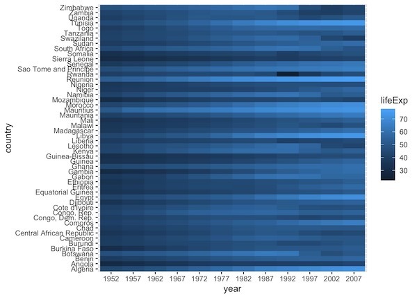
Simple Heatmap with geom_raster()
ggplot2 offeres two functions to make heatmap. We will first use geom_raster() function to make a simple heatmap. When we have the data tidy form, we just need add geom_raster() as a layer after specifying aesthetics. With aesthetics, we neewd to specify the variable to fill with colors.
df1 %>%
  ggplot(aes(y=country, x=year, fill=lifeExp)) +
  geom_raster()
By default, ggplot2 uses color scheme and fills the matrix with continuous blue scale.
Simple Heatmap with geom_tile()
Using geom_tile() to a heatmap is exactly the same as geom_raster(). We simply add as a layer.
df1 %>%
  ggplot(aes(y=country, x=year, fill=lifeExp)) +
  geom_tile()
And the heatmap made with geom_tile() looks exactly the same as before.

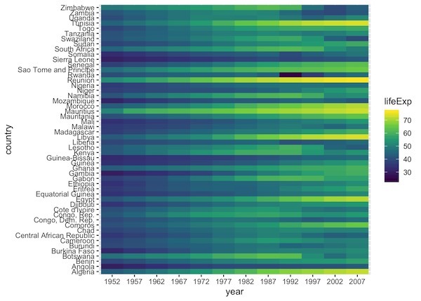
Heatmap with colors in ggplot2: Example 1
Interpreting a heatmap is much easier with right color scheme to make the heatmap. We can add already available color schemes in R to color the heatmap.
Here is an example, where we use scale_fill_viridis_c() to color the rectangles of heatmap.
df1 %>%
  ggplot(aes(y=country, x=year, fill=lifeExp)) +
  geom_raster() +
  scale_fill_viridis_c()
Now the heatmap looks much better and we can clearly see the differences over time in life expectancy for countries.
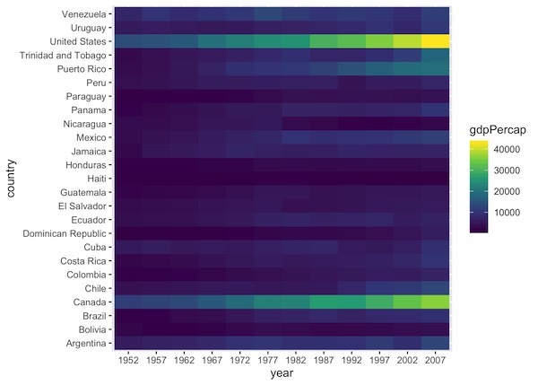
Heatmap with colors in ggplot2: Example 2
Here is another example of adding colors to a heatmap with ggplot2. In this example, we use data from America.
df2 <- gapminder %>%
  filter(continent %in% c("Americas")) %>%
  mutate(year=factor(year))
In this example, we make heatmap of gdpPercap instead of lifeExp over time.
df2 %>%
  ggplot(aes(y=country, x=year, fill=gdpPercap)) +
  geom_raster() +scale_fill_viridis_c()