Last updated on May 9, 2021
Heatmaps are a great way visualize a numerical dataset in a matrix form. Basically, a heatmap shows the actual data values as colors. When there is a broad trend in data, like change in data over rows or columns of data, a heat map makes it easy to see the broader trend.
In this tutorial, we will see how to make simple heatmaps using ComplexHeatmap, a R package that lets users to make complex heatmaps easily, combine multiple heatmaps and annotate them to make them easy to interpret.
Let us first install ComplexHeatmap package.
install.packages("ComplexHeatmap")
Here we load the package after making sure it is installed.
library(ComplexHeatmap)
In order to make simple heatmaps, we will simulate data matrix by using random numbers.
set.seed(2020)
n_row <- 30
n_col <- 10
data_matrix1 <- matrix(rnorm(n_row*n_col),ncol=n_col)
Heatmap() function in ComplexHeatmap Package
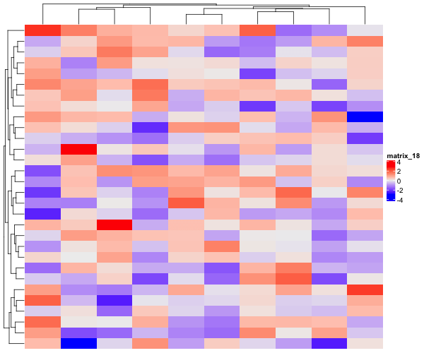
The data matrix we created does not really have any pattern, but simply random numbers from normal distribution. Let us use ComplexHeatmap package to visualize the data matrix. Heatmap() function with capital “H” is the main function for making heatmaps in ComplexHeatmap package.
Heatmap(data_matrix1)
By default, Heatmap() function clusters columns and rows and makes a heatmap. Also chooses a color palette automatically to show the data as heatmap.
Let us add some structure to our data matrix. To add some patterns to the data matrix, we update certain column values so that they are similar to each other. In the example below, we make half the columns to be sampled from normal distribution with mean 50 and the other half to have the mean 70. We also shuffle the columns, so the pattern in the data is not ordered.
set.seed(2020)
data_matrix2 <- matrix(rnorm(n_row*n_col),ncol=n_col)
# add structure to data
data_matrix2[,1:(n_col/2)] <- matrix(rnorm(n_row*n_col/2,mean=50,sd=5),
                            ncol=n_col/2)
data_matrix2[,((n_col/2)+1):n_col] <- matrix(rnorm(n_row*n_col/2,mean=70,sd=5),
                                    n_col/2)
# shuffle the columns
data_matrix2 <- data_matrix2[,sample(ncol(data_matrix2))]
# name columns and rows
colnames(data_matrix2) <- paste0("S",seq(1,n_col))
rownames(data_matrix2) <- paste0("f",seq(1,n_row))
How to Make Heatmaps without clustering columns and rows?
Now that we have a data matrix with some pattern in it, let us use Heatmap() and make a heatmap. This time we want to show the data matrix as it is, without clustering columns or rows.
Heatmap(data_matrix2,
         cluster_rows = FALSE,
         cluster_columns = FALSE)
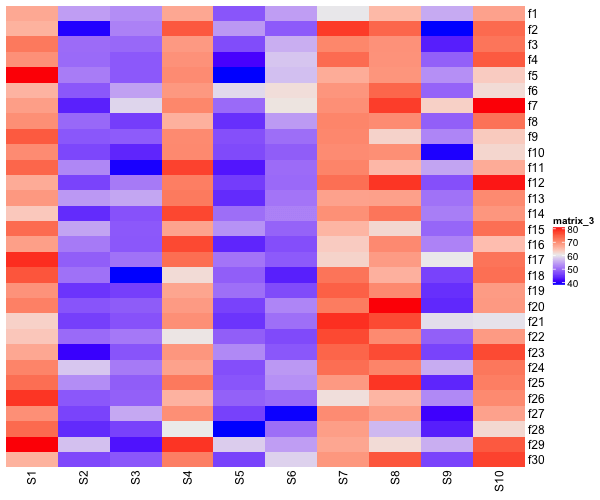
Heatmaps without clustering rows
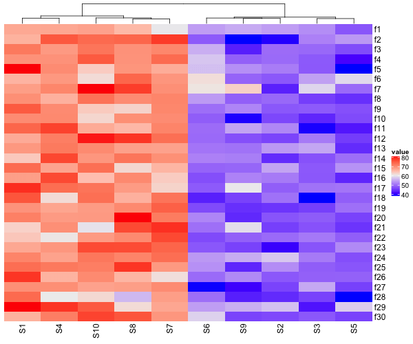
Our simulated data has patterns along the columns, bit not along rows. So, let us make a heatmap without cluster rows, but clustering columns.
Heatmap(data_matrix2,
        name = "value",
        cluster_rows = FALSE)
How To Combine Two Heatmaps with ComplexHeatmap?
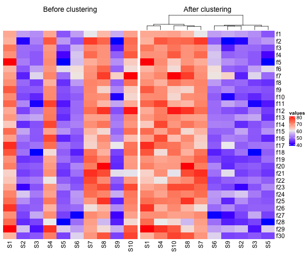
ComplexHeatmap also enables to combine multiple heatmaps together in a single plot. In this example below, we will combine two heatmaps, one before clustering columns and the one after clustering columns. We also specify title for each heatmap with “column_title” argument.
# first heatmap
h1 <- Heatmap(data_matrix2,
              cluster_rows =FALSE,
              cluster_columns=FALSE,
              name="before",
              show_heatmap_legend=FALSE,
              column_title = "Before clustering")
# second heatmap
h2 <-   Heatmap(data_matrix2,
                cluster_rows = FALSE,
                name="values",
                column_title = "After clustering")
Note that, we would like to use one common legend for our two heatmaps in the combined plot. We did that using the argument “show_heatmap_legend” while making the first heatmap. Let us combine the two heatmaps. We can place them side by side using + operator.
# Combine two heatmaps
h1+h2
Now we have a single plot with two heatmaps side-by-side.