Last updated on May 9, 2021
Heatmaps are one of the ways to visualize quantitative data in two dimension. Heatmaps show the actual data as colors and can reveal common patterns easily. In R, there are multiple ways to make heatmap starting from data in matrix form. In this post, we will learn how to make simple heatmaps with using pheatmap R package.
pheatmap is a very versatile R package with numerous options to customize and make better heatmaps. In this post we will first see how to make a simple heatmap first and then learn how to cluster the columns of the data to reveal pattern in the data.
Let us first install pheatmap R package from CRAN.
install.packages("pheatmap")
Let us load pheatmap to make heatmap.
library(pheatmap)
We will simulate data to create a data matrix. At first, we create a matrix of random numbers without any patterns.
n_row <- 30
n_col <- 10
# create a matrix with random numbers from normal distribution
data_matrix <- matrix(rnorm(n_row*n_col),ncol=n_col)
How to make simple heatmap with pheatmap?
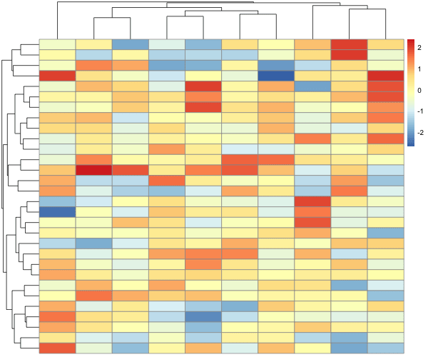
We can make a simple heatmap using pheatmap package using pheatmap function and the data in matrix form as argument. In the example below we provide the random data matrix as input to pheatmap() function.
pheatmap(data_matrix)
We get a heatmap that looks like this. By default pheatmap does a few things. For example, it uses diverging color palette to differentiate the values by different colors. And also pheatmap clusters columns and rows by default. It also shows the tree/dendrogram of the cluster with the heatmap. We also get a legend mapping colors to data values.
Let us add some signal so that some columns are correlated to each other. For convenience, we make the first half columns are correlated with each other and the second half of columns are correlated with each other. And we shuffle the columns.
# created correlated columns
data_matrix[,1:(n_col/2)] <- matrix(rnorm(n_row*n_col/2,mean=50,sd=5),
                            ncol=n_col/2)
data_matrix[,((n_col/2)+1):n_col] <- matrix(rnorm(n_row*n_col/2,mean=70,sd=5),
                                    n_col/2)
# shuffle columns
data_matrix <- data_matrix[,sample(ncol(data_matrix))]
# assign row and columns names
colnames(data_matrix) <- paste0("S",seq(1,n_col))
rownames(data_matrix) <- paste0("f",seq(1,n_row))
How to make heatmap without clustering columns and rows using pheatmap?
Now let us make a heatmap, but this time without clustering rows and columns. We can use cluster_rows and cluster_col and specify “FALSE” to not to cluster columns and rows.
pheatmap(data_matrix,
         cluster_rows = FALSE,
         cluster_cols = FALSE)
Now we have a heatmap showing the data as it is, without any row or column clustering.
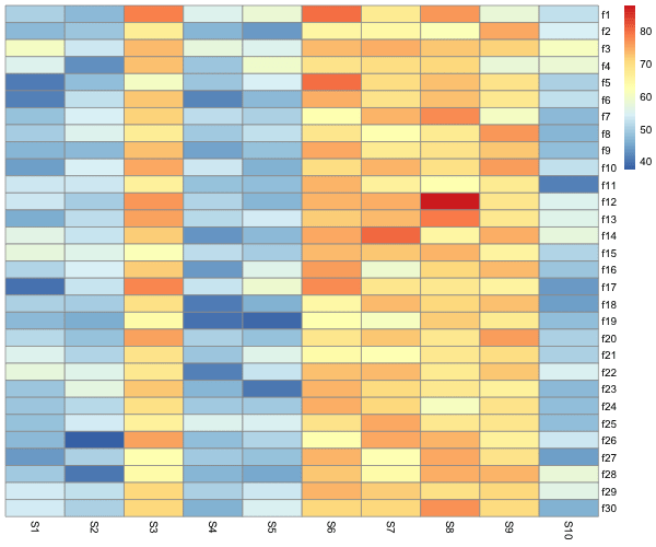
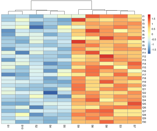
Even without clustering, We can see that there is a pattern in the data, some columns are more similar to each other than the others. We can cluster the data by columns using “cluster_cols = TRUE” and see the pattern easily.
pheatmap(data_matrix,
         cluster_rows = FALSE,
         cluster_cols = TRUE)
We can clearly see the pattern the our data is highly correlated and have similar values.
How to make heatmap with normalizing row values using pheatmap?
We can also scale, i.e. normalize rows or columns and make heatmaps easily with pheatmap. Scaling oftens helps to see the pattern when some rows or columns have high numerical values and bias the color codes.
pheatmap(data_matrix,
         cluster_rows = FALSE,
         cluster_cols = TRUE,
         scale="row")
In the example, we have scaled the rows and we can see that now the legend values are different from the original data.

pheatmap is a great R package for making clustered heatmaps with lots of options. Check out the possibilities to learn more
?pheatmap