Last updated on July 5, 2020
In this tutorial, we will see examples of how to make grouped violinplots using ggplot2’s geom_violin() function. Violinplots are like boxplot for visualizing numerical distributions for multiple groups. In comparison to boxplot, Violin plot adds information about density of distributions to the plot. A grouped violin plot is great for visualizing multiple grouping variables.
Let us load tidyverse and set ggplot2 theme_bw() with base size 16.
library(tidyverse)
theme_set(theme_bw(16))
We will use Palmer penguin dataset to make grouped violinplot with ggplot2 in R. Let us load the data directly from github page.
p2data <- "https://raw.githubusercontent.com/datavizpyr/data/master/palmer_penguin_species.tsv"
penguins_df <- read_tsv(p2data)
We can see that we have multiple groups corresponding to numerical variables.
penguins_df %>% glimpse()
## Rows: 344
## Columns: 7
## $ species           <chr> "Adelie", "Adelie", "Adelie", "Adelie", "Adelie", "…
## $ island            <chr> "Torgersen", "Torgersen", "Torgersen", "Torgersen",…
## $ culmen_length_mm  <dbl> 39.1, 39.5, 40.3, NA, 36.7, 39.3, 38.9, 39.2, 34.1,…
## $ culmen_depth_mm   <dbl> 18.7, 17.4, 18.0, NA, 19.3, 20.6, 17.8, 19.6, 18.1,…
## $ flipper_length_mm <dbl> 181, 186, 195, NA, 193, 190, 181, 195, 193, 190, 18…
## $ body_mass_g       <dbl> 3750, 3800, 3250, NA, 3450, 3650, 3625, 4675, 3475,…
## $ sex               <chr> "MALE", "FEMALE", "FEMALE", NA, "FEMALE", "MALE", "…
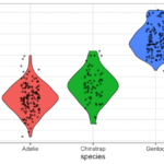
Let us first make a simple violin plot with ggplot2 using geom_violin() function. Our violinplot has species on x-axis and penguin’s flipper length is on y-axis. And we fill violinplot with species as color.
penguins_df %>%
  ggplot(aes(x = species,
             y = flipper_length_mm,
             fill = species))+
  geom_violin()
ggsave("Violinplot_ggplot2_colored_by_variable_R.png")
We get a nice violinplot that shows the differences in flipper length distribution across three penguin species.

Grouped Violin Plot with geom_violin()
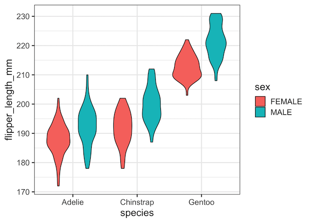
We have Sex information for each observation. We will make grouped violin plot with Sex as as subgroup for each species. To create the grouped violinplot, we need to change the fill argument, specifying Sex. Note that we used fill=species in the simple violin plot in the previous example filling violinplot based on values of species.
penguins_df %>%
  drop_na()%>%
  ggplot(aes(x=species,
             y=flipper_length_mm,
             fill=sex))+
  geom_violin()
ggsave("Grouped_Violinplot_ggplot2_R.png")
Here is our grouped violin plot with separate violinplot for each sex within each species.
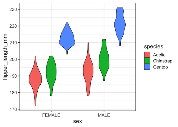
Since we have multiple group information corresponding to our numerical variable of interest, we can also group different set of variables in a grouped violin plot. For example, we can make sex as the primary group and species as subgroup in our violinplot using sex for x-axis variable and species for fill argument.
penguins_df %>%
  drop_na()%>%
  ggplot(aes(x=sex,
             y=flipper_length_mm,
             fill=species))+
  geom_violin()
Explore the Complete ggplot2 Guide
35+ tutorials with code: scatterplots, boxplots, themes, annotations, facets, and more—tested and beginner-friendly.
Visit the ggplot2 Hub → No fluff—just code and visuals.