Last updated on June 18, 2021
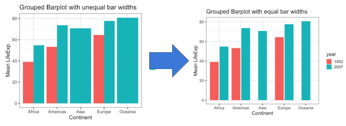
Grouped barplot allows to show third categorical variable in the barplot. Sometimes, when we make grouped barplot using ggplot2, some of the bars would have much broader width sizes. We typically get bars with uneven widths in a grouped barplot when some of the groups don’t have data for all of its levels.
In this tutorial, we will see how to make grouped barplots with same bar widths. We will first make grouped barplot with un-even bar width due to some data missing corresponding to the third categorical variable that we are using for grouping. And then we will use a trick or function available in ggplot2 version 3.3+ to make the bar widths the same in the grouped barplots.
Load Data and Packages for making Grouped Barplot
Let us load tidyverse. We will use gapminder dataset to make the grouped barplot.
library(tidyverse)
library(gapminder)
theme_set(theme_bw(base_size=16))
To make grouped barplot with uneven bar widths, we will create summary data from gapminder with average lifeExp for two years. We will also make sure it has missing data for the third group.
df <- gapminder %>%
  filter(year %in% c(1952, 2007)) %>%
  filter(continent %in% c("Africa", "Europe", "Americas") | year != 1952)%>%
  mutate(year=as.factor(year)) %>%
  group_by(continent, year) %>%
  summarize(ave_lifeExp=mean(lifeExp))
We can quickly spot that Asia does not data for the year 1952.
df %>% head()
## # A tibble: 6 x 3
## # Groups:   continent [4]
##   continent year  ave_lifeExp
##   <fct>     <fct>       <dbl>
## 1 Africa    1952         39.1
## 2 Africa    2007         54.8
## 3 Americas  1952         53.3
## 4 Americas  2007         73.6
## 5 Asia      2007         70.7
## 6 Europe    1952         64.4
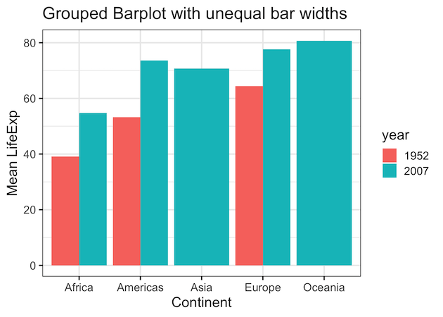
Grouped barplot with bars placed side by side: with uneven bar width
Let us make a grouped barplot with bars side by side using geom_col(). Here we use fill argument for the variable year. And we also use position=”dodge” to make the bars are placed side by side.
df  %>%
  ggplot(aes(continent,ave_lifeExp, fill=year))+
  geom_col(position="dodge") +
  labs(title="Grouped Barplot with unequal bar widths",
        x="Continent", y= "Mean LifeExp")
ggsave("barplots_with_uneven_barwidth.png")
Looking at the grouped barplot we can see that our bars double the size when we have missing data corresponding to one of the groups. For example, content Asia and Oceania are missing life Expectancy data for the year 1952.
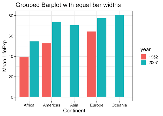
Grouped Barplot with equal bar widths using position_dodge2(preserve = “single”)
We can make the bar widths in a grouped barplots the same size using the position argument to geom_col() function. We specify position_dodge2(preserve = “single”) to make the widths the same. And this option is available from ggplot2 version 3.3 and above.
df  %>%
  ggplot(aes(continent,ave_lifeExp, fill=year))+
  geom_col(position=position_dodge2(preserve = "single")) +
  labs(title="Grouped Barplot with equal bar widths",
        x="Continent", y= "Mean LifeExp")
gsave("barplots_with_same_barwidth.png")
Voila!. now our bars in the grouped barplots have the same width as we aimed to have.
Explore the Complete ggplot2 Guide
35+ tutorials with code: scatterplots, boxplots, themes, annotations, facets, and more—tested and beginner-friendly.
Visit the ggplot2 Hub → No fluff—just code and visuals.