In this tutorial, we will learn how to make grouped barplot using Matplotlib in Python. We will learn how to make a gropued barplot in a realize scenario, where the data is in a Pandas dataframe and we have do some data munging to get the data to make grouped barplot. Let us first load the packages needed.
import matplotlib.pyplot as plt
import pandas as pd
We will use Palmer penguins dataset to make the grouped barplots using Matplotlib in Python and we load the data using Seaborn’s built-in dataset.
penguins = sns.load_dataset("penguins")
penguins.head()


species	island	bill_length_mm	bill_depth_mm	flipper_length_mm	body_mass_g	sex
0	Adelie	Torgersen	39.1	18.7	181.0	3750.0	Male
1	Adelie	Torgersen	39.5	17.4	186.0	3800.0	Female
2	Adelie	Torgersen	40.3	18.0	195.0	3250.0	Female
3	Adelie	Torgersen	NaN	NaN	NaN	NaN	NaN
4	Adelie	Torgersen	36.7	19.3	193.0	3450.0	Female
To get started let us calculate the data needed to make grouped barplot. In this example, we will make grouped barplot of penguin’s average body mass per species group by sex (male/female). Let us use Pandas’ groupby() function to the mean values of bodymass per species and sex.
df = (
    penguins.groupby(['species', 'sex'])["body_mass_g"]
    .mean()
    .reset_index()
)

df

species	sex	body_mass_g
0	Adelie	Female	3368.835616
1	Adelie	Male	4043.493151
2	Chinstrap	Female	3527.205882
3	Chinstrap	Male	3938.970588
4	Gentoo	Female	4679.741379
5	Gentoo	Male	5484.836066
The data we have now is in long form. For making plots with Matplotlib, dataframe in wide form is very useful. Let us reshape the long form data to wide form data using Pandas’ pivot() function.
df1 = (df
       .pivot(index="species", columns="sex")
       .reset_index()
      )
#df1.columns = df1.columns.to_flat_index()
df1.columns = ["_".join(a) for a in df1.columns.to_flat_index()]
df1

       species_	body_mass_g_Female	body_mass_g_Male
0	Adelie	3368.835616	4043.493151
1	Chinstrap 3527.205882	3938.970588
2	Gentoo	4679.741379	5484.836066
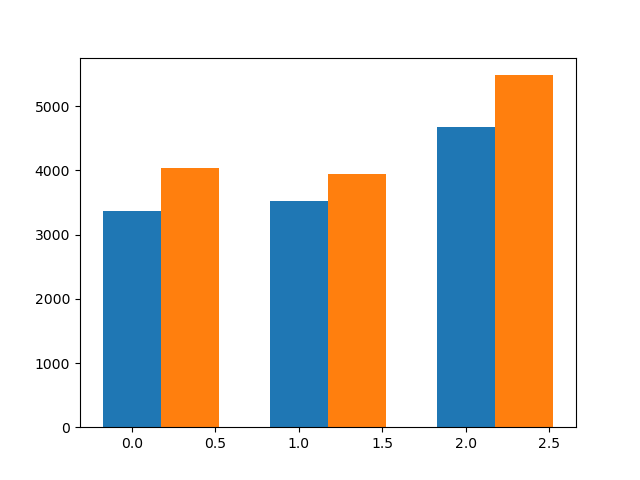
Now we have the data needed in the right shape. Let us go ahead and start making the grouped barplot. We will first specify the bar width and then use bar() function in Matplotlib at the correct x-axis location for each groups as shown below.
# Define the width of the bars
bar_width = 0.35
x= range(df1.shape[0])
# Plotting the grouped bars
plt.bar(x,
        df1.body_mass_g_Female,
        width=bar_width,
        label='Female')
plt.bar([i + bar_width for i in x],
        df1.body_mass_g_Male,
        width=bar_width,
        label='Male')
plt.savefig("Grouped_barplot_barebone_Matplotlib_Python.png")
We have the barebone grouped barplot ready now.
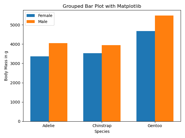
We can further customize the grouped barplot by adding labels, title and legend. We also customize the x-axis ticks using Matplotlib’s xticks() function.
# Define the width of the bars
bar_width = 0.35
x= range(df1.shape[0])
# Plotting the grouped bars
plt.bar(x,
        df1.body_mass_g_Female,
        width=bar_width,
        label='Female')
plt.bar([i + bar_width for i in x],
        df1.body_mass_g_Male,
        width=bar_width,
        label='Male')
plt.savefig("Grouped_barplot_barebone_Matplotlib_Python.png")
# Add labels, title, and legend
plt.xlabel('Species')
plt.ylabel('Body Mass in g')
plt.title('Grouped Bar Plot with Matplotlib')
plt.xticks([i + bar_width / 2 for i in x], df1.species_)
plt.legend()
plt.tight_layout()
And now we have the grouped barplot that wanted.