Last updated on November 10, 2020
In this tutorial, we will see examples of how to make grouped barplots using Seaborn in Python. Barcharts are great when you have two variables one is numerical and the other is a categorical variable. A barplot can reveal the relationship between them.
A Grouped barplot is useful when you have an additional categorical variable. Python’s Seaborn plotting library makes it easy to make grouped barplots.
Let us load Seaborn and needed packages.
import seaborn as sns
import matplotlib.pyplot as plt
import pandas as pd
We will use StackOverflow Survey results to make the grouped barplots. We load the processed data from the survey results available from datavizpyr.com’s github page.
data_url="https://bit.ly/3aYBbhQ"
data = pd.read_csv(data_url)
print(data.head(3))
   CompTotal Gender Manager YearsCode Age1stCode YearsCodePro   Education
0   180000.0    Man      IC        25         17           20    Master's
1    55000.0    Man      IC         5         18            3  Bachelor's
2    77000.0    Man      IC         6         19            2  Bachelor's
Stack Overflow survey data contains salary information, developer role, education, gender and coding experience. We will filter the data to consider only individual contributor with meaningful salary range.
data_df=data.query('Manager=="IC"')
data_df=data_df.query('CompTotal<600000 & CompTotal>30000')
Let us compute the average salary for each educational category and gender using Pandas groupby() function and agg() function.
df =data_df.groupby(['Gender', 'Education']).agg(mean_salary =("CompTotal",'mean'))
Now we almost have the data we want to make grouped barplots with Seaborn. Let us re-index the dataframe to flatten the multi-index data frame.
df =df.reset_index()
df.head()

  Gender             Education    mean_salary
0    Man            Bachelor's  111996.874328
1    Man  Less than bachelor's  105898.614085
2    Man              Master's  128996.547692
3    Man                   PhD  146498.245614
4    Man          Professional   91964.285714
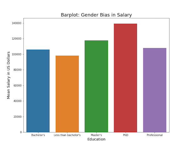
Simple Barplot with Seaborn in Python
Let us first make a simple barplot with Seaborn using Seaborn’s barplot() function(). Here we plot Education on x-axis and mean salary as the bar in barplot.
plt.figure(figsize=(10, 8))
sns.barplot(x="Education",
    y="mean_salary",
    data=df,
    ci=None )
plt.ylabel("Mean Salary in US Dollars", size=14)
plt.xlabel("Education", size=14)
plt.title("Barplot: Gender Bias in Salary", size=18)
plt.savefig("barplot_Seaborn_barplot_Python.png")
We get simple barplot autmatically colored by Seaborn’s barplot().
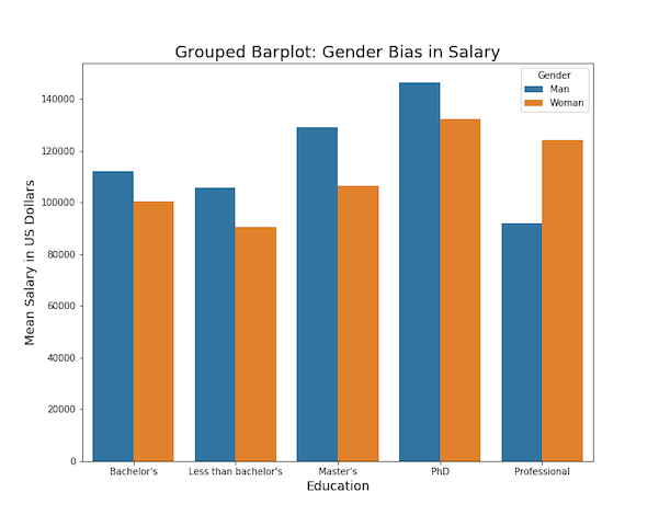
Grouped Barplot with Seaborn in Python
In this data set we have third variable, gender. We can add that as hue to make grouped barplot with Seaborn in addition to x and y-axis variables..
plt.figure(figsize=(10, 8))
sns.barplot(x="Education",
            y="mean_salary",
            hue="Gender",
            data=df)
plt.ylabel("Mean Salary in US Dollars", size=14)
plt.xlabel("Education", size=14)
plt.title("Grouped Barplot: Gender Bias in Salary", size=18)
plt.savefig("grouped_barplot_Seaborn_barplot_Python.png")