• Skip to primary navigation
  • Skip to main content
  • Skip to primary sidebar

Data Viz with Python and R

Learn to Make Plots in Python and R

  • Home
  • Python Viz
  • Seaborn
  • Altair
  • R Viz
  • ggplot2
  • About
    • Privacy Policy
  • Show Search
Hide Search

ggpointdensity plot: A ggplot extension combining scatter plot with density plot

datavizpyr · June 1, 2020 ·

Scatterplots are great for visualizing relationship between two quantitative variables. However, it suffers from overplotting when the number of data points is large. Another solution is plot the density instead of actjual points. However, sometimes you might want to see the datapoints.

ggpointdensity is a ggplot2 extension that solves the problem by combining scatterplot with density plot. You can install ggpointdensity package using

install.packages("ggpointdensityplot")

In this post we will see an example of combining scatterplot with density using ggpointdensity package. Let us load the packages needed.

library(ggplot2)
library(dplyr)
library(viridis)
library(ggpointdensity)
theme_set(theme_bw())

Let us simulate some data to make a scatter plot.

df <-  tibble(x = rnorm(5000, mean=0,sd = 1),
              y = rnorm(5000, mean=5,sd = 10))

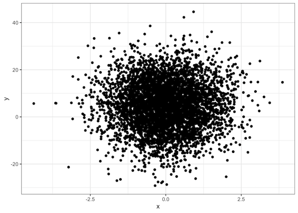
Let us start with making a simple scatter plot and see the problem of overplotting with large dataset.

df %>% 
  ggplot( mapping = aes(x = x, y = y)) +
  geom_point()
Scatter plot with overlapping data points

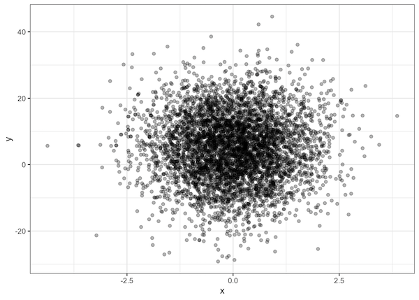
One simple solution is to add transparency to see the overlapping datapoints. It can be of help when the data size is not very big.

df %>% 
  ggplot( mapping = aes(x = x, y = y)) +
  geom_point(alpha=0.3)

A better solution is to combine scatterplot with density plot using ggpointdensity. Instead of geom_point() function, we use geom_pointdensity() function from ggpointdensity package. It is a ggplot2 extension as it offers new geom_* function and we can use it with ggplot2 code.

Avoiding overplotting of datapoints with transparency
ggplot(data = df, mapping = aes(x = x, y = y)) +
  geom_pointdensity() 

scatterplot with density plot

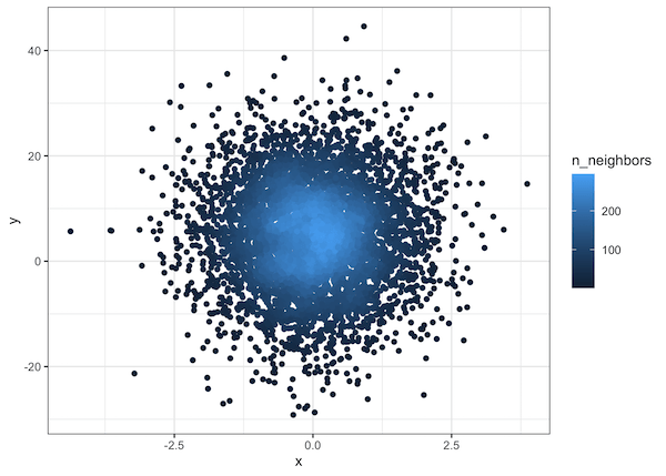
We can also add colors to reflect the density of datapoints using scale_color_virdis() function from viridis color pallete package.

ggplot(data = df, mapping = aes(x = x, y = y)) +
  geom_pointdensity() +
  scale_color_viridis()

scatterplot with density using ggpointdensity_

Related posts:

Customizing Labels on Bars in Side by side Stacked BarplotHow To Add Labels to Grouped Barplot with Bars Side-By-Side in R? ggplot2 legend on top of a plotHow To Adjust Legend Position in ggplot2? Visualizing Missing Data with Barplot in R ggplot2Visualizing Missing Data with Barplot in R Annotate Clusters with Ellipse with Labels ggforceHow To Annotate Clusters with Circle/Ellipse by a Variable in R

Filed Under: ggplot2, ggplot2 extension, ggpointdensity plot, R Tagged With: ggplot2, R

Primary Sidebar

Tags

Altair barplot Boxplot boxplot python boxplot with jiitered text labels Bubble Plot Color Palette Countplot Density Plot Facet Plot gganimate ggplot2 ggplot2 Boxplot ggplot2 error ggplot boxplot ggridges ggtext element_markdown() Grouped Barplot R heatmap heatmaps Histogram Histograms Horizontal boxplot Python lollipop plot Maps Matplotlib Pandas patchwork pheatmap Pyhon Python R RColorBrewer reorder boxplot ggplot Ridgeline plot Scatter Plot Scatter Plot Altair Seaborn Seaborn Boxplot Stock Price Over Time Stripplot UpSetR Violinplot Violin Plot World Map ggplot2

Buy Me a Coffee

Copyright © 2025 · Daily Dish Pro on Genesis Framework · WordPress · Log in

Go to mobile version