In this post, we will learn how to make beautiful plots with ggplot2 using themes from ggthemes R package. By default ggplot2 makes plots with grey background, using theme_grey(). ggplot2 comes with about 8 complete themes that help us change the look of a given plot. If you want to customize your plot with more options, ggplot2 extension package ggthemes can help help you.
Here we will see three example themes from ggthemes package using palmer penguin dataset.
library(tidyverse)
library(palmerpenguins)
packageVersion("dplyr")
[1] '1.1.2'
packageVersion("ggplot2")
[1] '3.4.3'
penguins %>% head()

# A tibble: 6 × 8
  species island    bill_length_mm bill_depth_mm flipper_length_mm body_mass_g
  <fct>   <fct>              <dbl>         <dbl>             <int>       <int>
1 Adelie  Torgersen           39.1          18.7               181        3750
2 Adelie  Torgersen           39.5          17.4               186        3800
3 Adelie  Torgersen           40.3          18                 195        3250
4 Adelie  Torgersen           NA            NA                  NA          NA
5 Adelie  Torgersen           36.7          19.3               193        3450
6 Adelie  Torgersen           39.3          20.6               190        3650
# ℹ 2 more variables: sex <fct>, year <int>
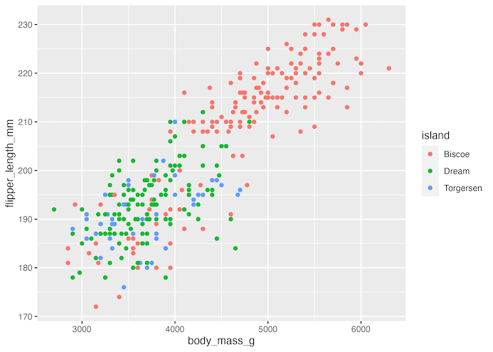
Let us make a scatterplot between two numerical variables from penguin dataset.
penguins %>%
  ggplot(aes(body_mass_g, flipper_length_mm, color=island))+
  geom_point()
ggsave("default_ggplot2_theme.png")
By default, ggplot2 uses a theme with grey background.
ggthemes offer a number of themes that to change the appearance of a plot made with ggplot. We can add the ggthemes’ theme as additional layer to the plot.
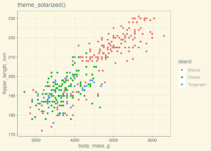
In the example below we make the scatterplot using solarized theme using theme_solarized() by adding as a layer.
penguins %>%
  ggplot(aes(body_mass_g, flipper_length_mm, color=island))+
  geom_point()+
  theme_solarized()+
  ggtitle("theme_solarized()")
ggsave("ggplot2_theme_solarized_ggthemes.png")
In the second example, we change the default ggplot2 theme to a theme that resembles google docs using theme_gdocs().
penguins %>%
  ggplot(aes(body_mass_g, flipper_length_mm, color=island))+
  geom_point()+
  theme_gdocs()+
  ggtitle("theme_gdocs()")
ggsave("ggplot2_theme_googledoc_ggthemes.png")

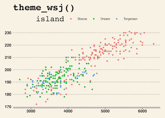
In the third example, we using ggthemes’ theme_wsj() to make the scatter plot with the style that wall street journal uses in their articles.
penguins %>%
  ggplot(aes(body_mass_g, flipper_length_mm, color=island))+
  geom_point()+
  theme_wsj()+
  ggtitle("theme_wsj()")
ggsave("ggplot2_theme_wallstreet_journal_ggthemes.png")