Last updated on September 15, 2023
In this tutorial, we will learn how to make a plot using ggplot2 such that the column name of interest in a plot is saved as a variable. And we are interested in using the variable name to make a boxplot. The ability to use a column name as a variable help us make more generalizable plot, for example writing a function to make a plot.
Let us get started by loading the packages. dplyr/ggplot2’s tidy evaluation methods enable us to use a variable while plotting. Therefore, let us also verify the ggplot2/dplyr versions.
library(tidyverse)
library(palmerpenguins)
theme_set(theme_bw(16))
packageVersion("dplyr")
[1] '1.1.2'
packageVersion("ggplot2")
[1] '3.4.3'
In the Palmer penguins data, we will be making a boxplot between species column and flipper_length_mm column.
penguins %>%
  head()

# A tibble: 6 × 8
  species island    bill_length_mm bill_depth_mm flipper_length_mm body_mass_g
  <fct>   <fct>              <dbl>         <dbl>             <int>       <int>
1 Adelie  Torgersen           39.1          18.7               181        3750
2 Adelie  Torgersen           39.5          17.4               186        3800
3 Adelie  Torgersen           40.3          18                 195        3250
4 Adelie  Torgersen           NA            NA                  NA          NA
5 Adelie  Torgersen           36.7          19.3               193        3450
6 Adelie  Torgersen           39.3          20.6               190        3650
# ℹ 2 more variables: sex <fct>, year <int>
How to make a plot with ggplot2 using column name in a variable?
Let us say the column name of interest in a plot is saved in a variable. In the example below, our column name species is stored in a variable named “plot_this”
plot_this <- "species"
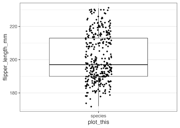
We are interested in making a boxplot with the column name in a variable on x-axis. If we naively try using the variable in a ggplot, we will not get the plot we need.
penguins %>%
  ggplot(aes(x = plot_this,
             y = flipper_length_mm)) +
    geom_boxplot(outlier.shape = NA)+
    geom_jitter(width=0.1)+
    theme(legend.position = "none")
Instead, we get a wrong plot as shown below.
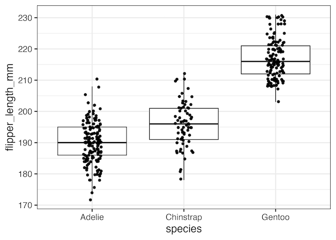
Using tidy evaluation principles we can access the right data by using .data[[plot_this]] for the variable name of interest.
penguins %>%
  ggplot(aes(x = .data[[plot_this]],
             y = flipper_length_mm))+
    geom_boxplot(outlier.shape = NA)+
    geom_jitter(width=0.1)+
    theme(legend.position = "none")
Now we get the boxplot with species on x-axis as we wanted.
Add colors to a plot with ggplot2 with a column name in a variable
If we want to add color to the boxplot, we will use the same approach with tidy evaluation. This time we will also use .data[[plot_this]] to specify the variable for coloring the boxplot.
penguins %>%
  ggplot(aes(x = .data[[plot_this]],
             y = flipper_length_mm))+
             #color = .data[[plot_this]])) +
    geom_boxplot(outlier.shape = NA)+
    geom_jitter(width=0.1)+
    theme(legend.position = "none")

Explore the Complete ggplot2 Guide
35+ tutorials with code: scatterplots, boxplots, themes, annotations, facets, and more—tested and beginner-friendly.
Visit the ggplot2 Hub → No fluff—just code and visuals.


