In this tutorial, we will learn how to duplicate the primary axis in a plot made with ggplot2. We can duplicate either y-axis or x-axis using ggplot2’s sec.axis() function.
Here we will first see an example of duplication y axis and then an example duplicating x-axis using sec.axis method.
Let us load tidyverse.
library(tidyverse)
theme_set(theme_bw(16))
How to duplicate primary axis in ggplot2
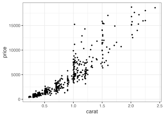
First, let us make a scatter plot with ggplot2. By default, ggplot2 places the x/y axies in their natural locations, i.e. x-axis at the bottom and y-axis on the left side.
diamonds %>%
  slice_sample(n=500) %>%
  ggplot(aes(x=carat, y=price))+
  geom_point()
ggsave("how_to_duplicate_y_axisin_ggplot2.png")
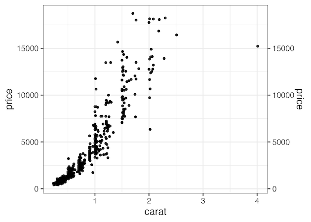
Duplicate y-axis in ggplot2 with sec.axis
With sec.axis argument in ggplot2, we can duplicate any primary axis. In the example below we duplicate y-axis using sec.axis argument to to scale_y_continuous() layer. To duplicate we assign dup_axis() to sec.axis argument.
diamonds %>%
  slice_sample(n=500) %>%
  ggplot(aes(x=carat, y=price))+
  geom_point()+
  scale_y_continuous(sec.axis = dup_axis())
ggsave("duplicate_y_axis_with_sec_axis_ggplot2.png")
Duplicate y-axis in ggplot2 with sec.axis
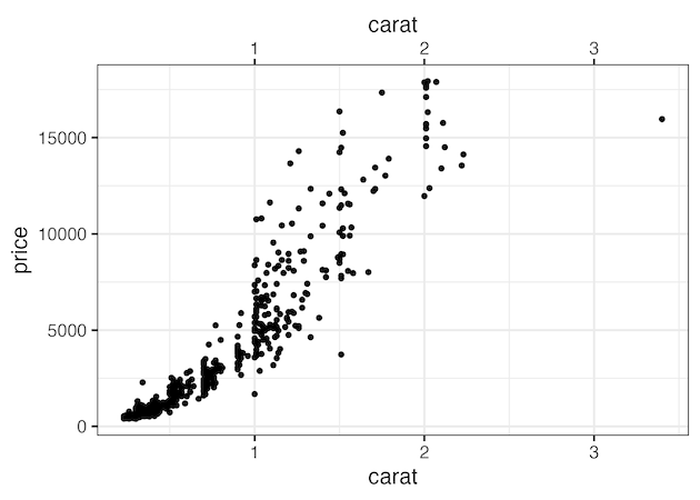
Similarly, we can duplicate x-axis using scale_x_continous() layer as shown below.
diamonds %>%
  slice_sample(n=500) %>%
  ggplot(aes(x=carat, y=price))+
  geom_point()+
  scale_x_continuous(sec.axis = dup_axis())
ggsave("duplicate_x_axis_with_sec_axis_ggplot2.png")
Explore the Complete ggplot2 Guide
35+ tutorials with code: scatterplots, boxplots, themes, annotations, facets, and more—tested and beginner-friendly.
Visit the ggplot2 Hub → No fluff—just code and visuals.


