Last updated on January 12, 2021
Dumbbell plots or connected dot plots are a great way to visualize change in something over time for multiple groups. Dumbbell plots are a great alternative to grouped barchart as dumbbell plot uses much less ink on the paper and is much simpler to understand.
We can use ggplot2 extension packages to make a dumbbell plot. However, in this post we will learn how to make a dumbbell plot in R using ggplot2 from scratch. We will use gapminder dataset and make dumbbell plot that shows how multiple countries life expectancy value changes from year 1952 to 2007.
Let us get started by loading the gapminder data and tidyverse suite of R packages to make dumbbell plots.
library(tidyverse)
theme_set(theme_bw())
We load the gapminder data from datavizpyr.com’s github page.
gapminder <- read_csv("https://raw.githubusercontent.com/datavizpyr/data/master/gapminder-FiveYearData.csv")
head(gapminder)

# # A tibble: 6 x 6
##   country      year      pop continent lifeExp gdpPercap
##   <chr>       <dbl>    <dbl> <chr>       <dbl>     <dbl>
## 1 Afghanistan  1952  8425333 Asia         28.8      779.
## 2 Afghanistan  1957  9240934 Asia         30.3      821.
## 3 Afghanistan  1962 10267083 Asia         32.0      853.
## 4 Afghanistan  1967 11537966 Asia         34.0      836.
## 5 Afghanistan  1972 13079460 Asia         36.1      740.
## 6 Afghanistan  1977 14880372 Asia         38.4      786.
For making dumbbell plot, let us subset the data for just two years 1952 and 2007. Also, we focus on one of the continents in the gapminder data.
df <- gapminder %>%
  filter(year %in% c(1952,2007)) %>%
  filter(continent=="Asia")
With this data we can make dumbbell plot to compare life expectancy change from 1952 to 2007 for all asian countries. We make dumbbell plot by plotting points for each time point and connect them with a line for each country. In order to connect the points, we need specify which rows or countries need to be connected. We create a new variable that specifies the group corresponding to each country.
df <- df %>%
  mutate(paired = rep(1:(n()/2),each=2),
         year=factor(year))
Now we have the data ready in the format to make dumbbell plot.
# # A tibble: 6 x 7
##   country     year        pop continent lifeExp gdpPercap paired
##   <chr>       <fct>     <dbl> <chr>       <dbl>     <dbl>  <int>
## 1 Afghanistan 1952    8425333 Asia         28.8      779.      1
## 2 Afghanistan 2007   31889923 Asia         43.8      975.      1
## 3 Bahrain     1952     120447 Asia         50.9     9867.      2
## 4 Bahrain     2007     708573 Asia         75.6    29796.      2
## 5 Bangladesh  1952   46886859 Asia         37.5      684.      3
## 6 Bangladesh  2007  150448339 Asia         64.1     1391.      3
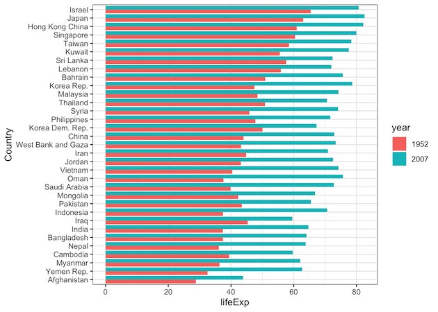
Let us first make grouped barplot to show the change in life expectancy for each country between two years.
df %>%
  ggplot(aes(x= lifeExp, y= reorder(country,lifeExp), fill=year)) +
  geom_col(position="dodge")+
  labs(y="Country")
We can see that the grouped barplot pretty busy and not easy to understand the patterns in the data.
Dumbbell plot with ggplot2
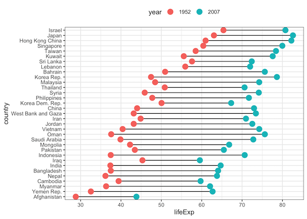
We can make dumbbell plot using ggplot2 with geom_line() and geom_point() function. It is very similar to our earlier post on connecting points with line, but this time we have character/categorical variables on y-axis. Note the group argument within aes() of geom_line() function. It connects the points with a line.
df %>%
  ggplot(aes(x= lifeExp, y= country)) +
  geom_line(aes(group = paired))+
    geom_point(aes(color=year), size=4) +
    theme(legend.position="top")
We now have the basic dumbbell plot made with ggplot2 from scratch. Comparing this to the grouped barplot, we can see how much of ink we have saved with the dumbbell plot.

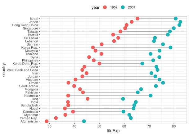
Reordering Dumbbell plot with ggplot2
We can reorder the dumbbell plot by life expectancy values using reorder() function to make it easy to read the plot.
df %>%
  ggplot(aes(x= lifeExp, y= reorder(country,lifeExp))) +
  geom_line(aes(group = paired))+
    geom_point(aes(color=year), size=4) +
  labs(y="country")
Customizing Dumbbell plot with ggplot2
Let us customize the dumbbell plot to make it better. First we change the line color to grey so that we can highlight the change between two points.
df %>%
  group_by(paired) %>%
  ggplot(aes(x= lifeExp, y= reorder(country,lifeExp))) +
  geom_line(aes(group = paired),color="grey")+
    geom_point(aes(color=year), size=4) +
  labs(y="country")
Adding colors to Dumbbell plot with ggplot2
Let us further customize the dumbbell plot by changing the colors of points in the plot. We use scale_color_brewer() to specify the palette of interest from Rcolorbrewer. We also change the ggplot2 theme to theme_classic() that keeps the theme simple without the grey lines in the background.
df %>%
  ggplot(aes(x= lifeExp, y= reorder(country,lifeExp))) +
  geom_line(aes(group = paired),color="grey")+
    geom_point(aes(color=year), size=6) +
  labs(y="country")+
  theme_classic(24)+
  theme(legend.position="top") +
  scale_color_brewer(palette="Accent", direction=-1)+
We get a much better looking dumbbell plot that showcases the change in life expectancy more clearly.

Explore the Complete ggplot2 Guide
35+ tutorials with code: scatterplots, boxplots, themes, annotations, facets, and more—tested and beginner-friendly.
Visit the ggplot2 Hub → No fluff—just code and visuals.


