In this tutorial, we will learn how to compute correlation of one variable against multiple variables and make a plot showing the correlation values with error bars. This nice trick uses map() functions from purrr package to compute multiple correlations and uses broom’s tidy() function to clean up the correlation model to get the results in tidy format. And the trick is from Tidy Modeling book that just got published and has been available online for free for a while at https://www.tmwr.org/.
Let us get started with loading the packages needed.
library(tidyverse)
library(broom)
theme_set(theme_bw(16))
We will use the mtcars dataset built in R.
mtcars %>% head()

                   mpg cyl disp  hp drat    wt  qsec vs am gear carb
Mazda RX4         21.0   6  160 110 3.90 2.620 16.46  0  1    4    4
Mazda RX4 Wag     21.0   6  160 110 3.90 2.875 17.02  0  1    4    4
Datsun 710        22.8   4  108  93 3.85 2.320 18.61  1  1    4    1
Hornet 4 Drive    21.4   6  258 110 3.08 3.215 19.44  1  0    3    1
Hornet Sportabout 18.7   8  360 175 3.15 3.440 17.02  0  0    3    2
Valiant           18.1   6  225 105 2.76 3.460 20.22  1  0    3    1
In this example, we will compute correlation of one numerical variable against all the other numerical variables in a dataframe. Here, we will compute correlation of mpg with all the other variables using cor.test() function available in base R. Since we are computing correlation against all the variables in the dataframe, we use map() function to apply cor.test() function on each variable.
# perform correlation test with cor.test for mpgs against all the other variables
corr_res <- mtcars %>%
  select(-mpg) %>%
  map(cor.test, y=mtcars$mpg)
The result we get is list object containing the results from cor.test() for each variable. For example, if we look at the first element of the list, we can see that we have the Pearson correlation between mpg and cyl variables and all the results from cor.test().
# look at the correlation result at the first list element
corr_res[[1]]

$cyl

    Pearson's product-moment correlation

data:  .x[[i]] and mtcars$mpg
t = -8.9197, df = 30, p-value = 6.113e-10
alternative hypothesis: true correlation is not equal to 0
95 percent confidence interval:
 -0.9257694 -0.7163171
sample estimates:
      cor
-0.852162
A better way to easily access the results from a model like cor.test() output is to use broom’s tidy() function. tidy() extracts the results and presents to us as a nice tibble that is easy to access. Here from the first cor.test() result we get the correlation value, p value , confident intervals and more.
tidy(corr_res[[1]])

# A tibble: 1 × 8
  estimate statistic  p.value parameter conf.low conf.high method    alternative
     <dbl>     <dbl>    <dbl>     <int>    <dbl>     <dbl> <chr>     <chr>
1   -0.852     -8.92 6.11e-10        30   -0.926    -0.716 Pearson'… two.sided
We can apply tidy() function to each of the cor.test results using map_dfr() function that outputs a tibble with cor.test() results from all the variables.
corr_res %>%
  map_dfr(tidy, .id="predictor")

# A tibble: 10 × 9
   predictor estimate statistic  p.value parameter conf.low conf.high method
   <chr>        <dbl>     <dbl>    <dbl>     <int>    <dbl>     <dbl> <chr>
 1 cyl         -0.852     -8.92 6.11e-10        30  -0.926     -0.716 Pearson's…
 2 disp        -0.848     -8.75 9.38e-10        30  -0.923     -0.708 Pearson's…
 3 hp          -0.776     -6.74 1.79e- 7        30  -0.885     -0.586 Pearson's…
 4 drat         0.681      5.10 1.78e- 5        30   0.436      0.832 Pearson's…
 5 wt          -0.868     -9.56 1.29e-10        30  -0.934     -0.744 Pearson's…
 6 qsec         0.419      2.53 1.71e- 2        30   0.0820     0.670 Pearson's…
 7 vs           0.664      4.86 3.42e- 5        30   0.410      0.822 Pearson's…
 8 am           0.600      4.11 2.85e- 4        30   0.318      0.784 Pearson's…
 9 gear         0.480      3.00 5.40e- 3        30   0.158      0.710 Pearson's…
10 carb        -0.551     -3.62 1.08e- 3        30  -0.755     -0.250 Pearson's…
# … with 1 more variable: alternative <chr>
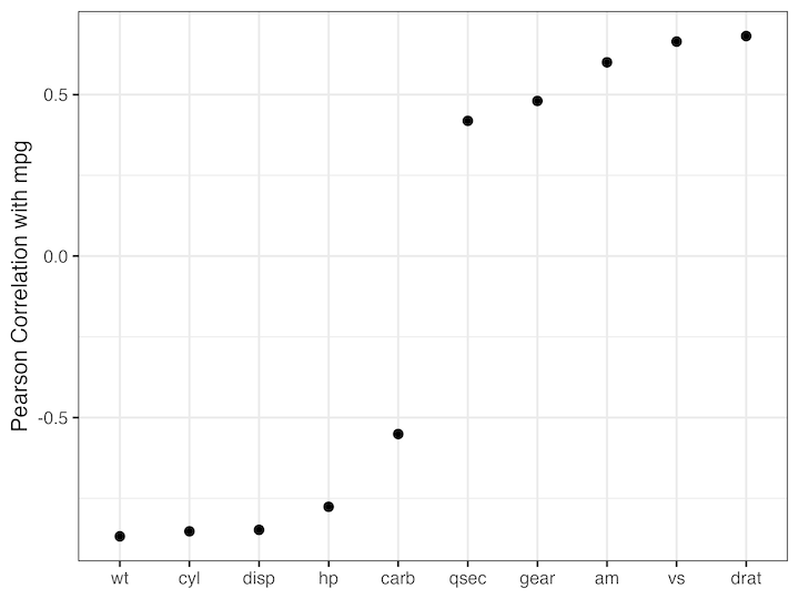
Now we have the results that we need to make correlation plot. Let us start with plotting the Pearson correlation coefficient as dot. Here we order the variables by their correlation estimate and make dot plot.
corr_res %>%
  map_dfr(tidy, .id="predictor") %>%
  ggplot(aes(x=fct_reorder(predictor,estimate), y=estimate))+
  geom_point(size=3)+
  labs(x=NULL, y="Pearson Correlation with mpg")
ggsave("Correlation_dot_plot.png", width=8, height=6)

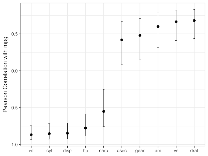
We can also add the confidence intervals of the estimate os correlation as an error bar. And we get the plot like this and this can help us quickly understand the relationship of the variables with a variable of interest. Here we can see that some of the variables are negatively correlated with mpg while the others are positively correlated.
corr_res %>%
  map_dfr(tidy, .id="predictor") %>%
  ggplot(aes(x=fct_reorder(predictor,estimate), y=estimate))+
  geom_point(size=3)+
  geom_errorbar(aes(ymin=conf.low, ymax=conf.high), width=0.1)+
  labs(x=NULL, y="Pearson Correlation with mpg")
ggsave("Correlation_estimate_with_error_bar.png", width=8, height=6)

Explore the Complete ggplot2 Guide
35+ tutorials with code: scatterplots, boxplots, themes, annotations, facets, and more—tested and beginner-friendly.
Visit the ggplot2 Hub → No fluff—just code and visuals.


