Scatter plots are a great way to visualize the trend between two quantitative variables. Sometimes, you may have paired quantitative variables and would like to see the how the pairs are related. For example you may have two quantitative variables corresponding to two different time points and would like to connect the paired data points by lines.
In this example, we will learn how to connect paired data points with lines on a scatterplot using ggplot2. First, let us load the packages needed. We will use the gapminder data from gapminder data package.
library(tidyverse)
library(gapminder)
theme_set(theme_bw(16))
Data for making scatterplots with paired data points
Let us filter the gapminder data to contain data corresponding to two years for Asia. In addition to filtering and selecting certain columns of interest, we also create a new variable that specifies the paired observations. In this example, country’s data for the two years are paired.
df <- gapminder %>%
  filter(year %in% c(1952,2007)) %>%
  filter(continent %in% c("Asia")) %>%
  select(country,year,lifeExp, gdpPercap)%>%
  mutate(paired = rep(1:(n()/2),each=2),
         year=factor(year))
And this is how our data looks like.
df %>% head()

## # A tibble: 6 × 5
##   country     year  lifeExp gdpPercap paired
##   <fct>       <fct>   <dbl>     <dbl>  <int>
## 1 Afghanistan 1952     28.8      779.      1
## 2 Afghanistan 2007     43.8      975.      1
## 3 Bahrain     1952     50.9     9867.      2
## 4 Bahrain     2007     75.6    29796.      2
## 5 Bangladesh  1952     37.5      684.      3
## 6 Bangladesh  2007     64.1     1391.      3
We will make scatter plot between lifeExp and gdpPercap for each country and connect the data from same country with lines.
Simple scatter plot in ggplot2
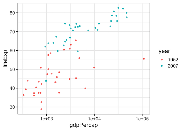
To start with, let us make a simple scatter plot using ggplot2.
df %>%
  ggplot(aes(gdpPercap,lifeExp)) +
  geom_point(aes(color=year)) +
  scale_x_log10()
ggsave("simple_scatterplot_with_legend_ggplot2.png")
We have colored the data points by the third variable year. We can see that lifeExp is higher for countries with higher gdpPercap. And also notice that the data from year 2002 is pretty different from 1952.
Connecting Paired Points with lines using geom_line()
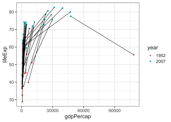
Although we can glean a lot from the simple scatter plot, one might be interested in learning how each country performed in the two years. We can get that information easily by connecting the data points from two years corresponding to a country.
In ggplot2 we can add lines connecting two data points using geom_line() function and specifying which data points to connect inside aes() using group argument.
df %>%
  ggplot(aes(gdpPercap,lifeExp)) +
  geom_point(aes(color=year)) +
  geom_line(aes(group = paired))
ggsave("scatterplot_connecting_paired_points_with_lines_ggplot2.png")
Now we get a scatter plot connecting paired data with lines.
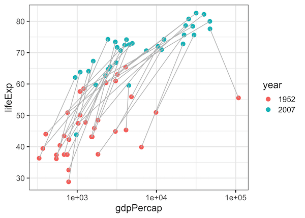
Customizing the lines connecting paired data points
Let us further customize the scatterplot with connected lines. We can change the size of scatter plot with size argument inside geom_point() and change the color of the connecting to lines to grey so that we can clearly see the data and the lines. We use color=”grey” argument inside geom_line().
df %>%
  ggplot(aes(gdpPercap,lifeExp, color=year)) +
  geom_point(aes(fill=year),size=3) +
  scale_x_log10()+
  geom_line(aes(group = paired),color="grey")
ggsave("customizing_scatterplot_connecting_paired_points_with_lines_ggplot2.png")
And we get a nice scatter plot with paired points connected by line.
Connecting paired data points with arrows
Another useful customization to the scatter plot with connected points is to add arrow pointing the direction from one year to another. We can use arrow argument inside geom_line() specifying the type and the length of arrowhead.
df %>%
  ggplot(aes(gdpPercap,lifeExp, color=year)) +
  geom_point(aes(fill=year),size=3) +
  scale_x_log10()+
  geom_line(aes(group = paired),
            color="grey",
            arrow = arrow(type = "closed",
                          length=unit(0.075, "inches")))
ggsave("customizing_scatterplot_connecting_paired_points_with_lines_arrows_ggplot2.png")
Now we have scatter plot with arrows connecting the paired data points. The arrows can help us understand the direction of change over time more clearly.