The goal of patchwork is to make it ridiculously simple to combine separate ggplots into the same graphic. As such it tries to solve the same problem as gridExtra::grid.arrange() and cowplot::plot_grid but using an API that incites exploration and iteration, and scales to arbitrarily complex layouts.
In this tutorial, we will a simple example of combining multiple plots made with ggplot2 into a single figure using the R package patchwork.
1 2 3 | library(tidyverse)library(patchwork)theme_set(theme_bw(base_size=16)) |
We will use processed data from 2019 StackOverlflow Developer Survey data to make multiple plots with ggplot2.
Let us load the processed data from github.
1 2 | stackoverflow_file <- "https://raw.githubusercontent.com/datavizpyr/data/master/SO_data_2019/StackOverflow_survey_filtered_subsampled_2019.csv"survey_results <- read_csv(stackoverflow_file) |
The processed data from StackOverlflow survey has years of coding experience, education and salary.
1 2 3 4 5 6 7 8 9 10 11 12 | survey_results %>% head()## # A tibble: 6 x 7## CompTotal Gender Manager YearsCode Age1stCode YearsCodePro Education ## <dbl> <chr> <chr> <chr> <chr> <chr> <chr> ## 1 180000 Man IC 25 17 20 Master's ## 2 55000 Man IC 5 18 3 Bachelor's ## 3 77000 Man IC 6 19 2 Bachelor's ## 4 67017 Man IC 4 20 1 Bachelor's ## 5 90000 Man IC 6 26 4 Less than bachelor…## 6 58000 Man IC 16 14 4 Bachelor's |
Let us make three plots with ggplot2 and save the ggplot2 object into three variables.
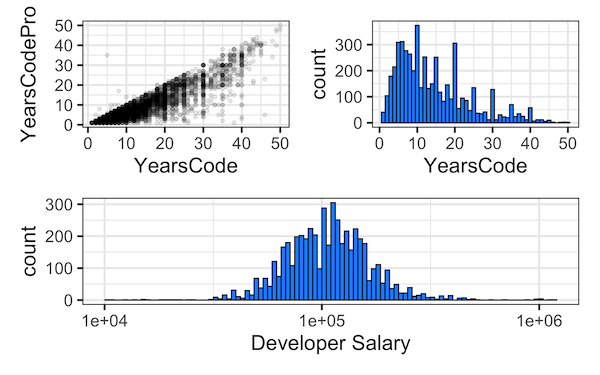
First plot is a scatter plot between years of professional coding experience and years of coding experience.
1 2 3 4 5 | p1 <- survey_results %>% mutate(YearsCode=as.numeric(YearsCode), YearsCodePro=as.numeric(YearsCodePro)) %>% ggplot(aes(x=YearsCode, y=YearsCodePro)) + geom_point() |
And the second plot is a histogram of years of coding experience
1 2 3 4 | p2 <-survey_results %>% mutate(YearsCode=as.numeric(YearsCode)) %>% ggplot(aes(x=YearsCode)) + geom_histogram(bins=50, color="black",fill="dodgerblue") |
And the third plot is also a histogram of developer salary.
1 2 3 4 5 6 | p3 <- survey_results %>% mutate(YearsCode=as.numeric(YearsCode)) %>% ggplot(aes(x=CompTotal)) + geom_histogram(bins=100,color="black",fill="dodgerblue") + scale_x_log10()+ labs(x="Developer Salary") |
Combine Multiple ggplot2 plots with patchwork
Let us combine the three plots made with ggplot2 into a grid such that the first row contains the first two plots (p1 and p2) and the second row contains the second plot.
1 | (p1+p2)/p3 |
Combine Multiple ggplot2 plots with a tag for each plot
When you combine multiple plots, it is a good idea to name or tag each plot either with letters or roman numerals. Using Patchwork, we can tag each plot object using plot_annotation() function as shown below.
1 | (p1+p2)/p3 + plot_annotation(tag_levels = 'A') |

Want to learn more examples of using patchwork on ggplot2 plots? Check out here for more patchwork examples.