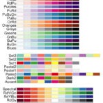
In this tutorial we will learn to how to color bars in a barplot using R Color Brewer’s color palettes. R Color Brewer package “RColorBrewer” offers numerous color palettes that are useful in common situations. For example, it gives “Sequential” palette for ordered data, “Diverging” palette for highlighting deviations from baseline and “Qualitative” palette for unordered data.
We will make a barplot with unordered bars and show how to use RColorBrewer to add colors to the bars.
Load Packages and Create a Dataframe to make a barplot
library(tidyverse)
library(RColorBrewer)
theme_set(theme_bw(16))
Let us create a new dataframe with data to make a simple barplot.
df <- tibble(groups =letters[1:5],
             n = sample(10,5))
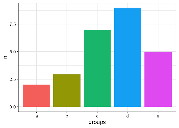
Here we have five groups/categories and a numerical value associated with each group.
df
## # A tibble: 5 × 2
##   groups     n
##   <chr>  <int>
## 1 a          6
## 2 b         10
## 3 c          5
## 4 d          7
## 5 e          8
Barplot with Default Bar Colors
While making a simple barplot using ggplot2, we can add colors using fill argument within aes() function. We fill the bars with colors based on the group/category.
df %>%
  ggplot(aes(x=groups,y=n,fill=groups))+
  geom_col()+
  theme(legend.position = "none")
ggplot2 automatically chooses colors to fill the bars in the barplot and it looks like this.
Color Bars in Barplot with RColorBrewer Palette (Example 1)
We can change the color of the bars in the barplot using RColorbrewer’s color palette. To change the default color palette to RColoBrewer’s paeltte, we use scale_fill_brewer() function and specify the palette name as argument. We use scale_fill_*, as will are filling the bars with colors. Here we use “Set1” color palette available in RColorBrewer.
df %>%
  ggplot(aes(x=groups,y=n,fill=groups))+
  geom_col()+
  theme(legend.position = "none")+
  scale_fill_brewer(palette = "Set1")

Color Bars in Barplot with RColorBrewer Palette (Example 2)
In this second example, we fill the bars using “Accent” color paletter available as part of RColorBrewer’s “Qualitative” palette for unordered data.
df %>%
  ggplot(aes(x=groups, y=n, fill=groups))+
  geom_col() +
  theme(legend.position = "none")+
  scale_fill_brewer(palette = "Accent")