Last updated on August 25, 2025
Are your ggplot2 axis tick labels too small to read in presentations, reports, or publications? Don’t worry—you’re not alone. In this step-by-step tutorial, you’ll learn how to change axis tick label size in ggplot2 using theme(), element_text(), and other customization options. Each example comes with ready-to-use R code and output so you can immediately apply it to your own plots.
Axis tick labels play a critical role in interpreting charts, but ggplot2’s defaults are often too small—especially when sharing plots in slides or scientific journals. Adjusting the font size of tick labels is one of the simplest ways to make your visualizations more professional, accessible, and reader-friendly.
By the end of this guide, you’ll be able to control x-axis tick label size, y-axis tick label size, or both, with fine-grained customization. We’ll start with default settings and then progressively apply theme() arguments to scale up your labels for better clarity.
We can change the size of axis tick labels in ggplot2 using theme() function in combination with element_text() function.
Setup
We’ll use tidyverse and the Palmer Penguins dataset. A simple theme sets a readable base size so you can see how each example overrides or complements it. If you use a different theme (e.g., theme_minimal()), the approach is identical—just plug in the examples below.
library(tidyverse)
library(palmerpenguins)
theme_set(theme_bw(16))
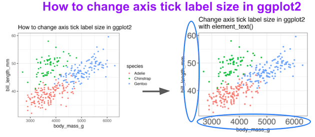
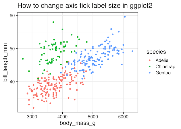
1) Default ggplot2 axis tick label size
Start with a baseline scatter plot. Here, the tick label size is inherited from theme_bw(16). This “before” view makes it easy to compare the effect of scaling tick labels in subsequent steps. If your labels already look small on screen, imagine them projected in a large room—this is exactly where resizing helps.
penguins |>
  ggplot(aes(body_mass_g, bill_length_mm, color=species))+
  geom_point()+
  labs(title="How to change axis tick label size in ggplot2")
ggsave("how_to_change_axis_tick_label_size_ggplot2.png")
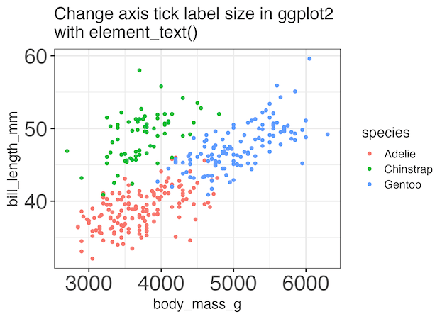
2) Change both axis tick label sizes with axis.text
To scale all tick labels at once, target the axis.text theme element. This modifies both x and y tick labels in a single line using element_text(size = ...). It’s the fastest way to prepare figures for slides and print where legibility is paramount. Increase or decrease the size based on viewing distance and layout.
penguins |>
  ggplot(aes(body_mass_g, bill_length_mm, color=species))+
  geom_point()+
  labs(title=stringr::str_wrap("Change axis tick label size in ggplot2 with element_text()", width=40)) +
  theme(axis.text = element_text(size=24))
ggsave("change_axis_tick_label_size_ggplot2_using_theme.png")
3) Change x-axis tick label size only
When horizontal labels carry more burden (dates, categories, dense ticks), resize only the x-axis with axis.text.x. This keeps the y-axis compact while making the x-axis immediately readable. Combine with rotation (angle) and alignment (hjust) if your categories are long.
penguins |>
  ggplot(aes(body_mass_g, bill_length_mm, color=species))+
  geom_point()+
  labs(title=stringr::str_wrap("Change x-axis tick label size in ggplot2 with element_text()", width=40)) +
  theme(axis.text.x= element_text(size=24))
ggsave("change_x_axis_tick_label_size_ggplot2_using_theme.png")

4) Change y-axis tick label size only
For bar charts or category-heavy visuals, the y-axis often deserves emphasis. Resize those tick labels with axis.text.y while leaving the x-axis unchanged. This helps readers compare categories quickly and is useful when labels are long or crowded.
penguins |>
  ggplot(aes(body_mass_g, bill_length_mm, color=species))+
  geom_point()+
  labs(title=stringr::str_wrap("Change y-axis tick label size in ggplot2 with element_text()", width=40)) +
  theme(axis.text.y = element_text(size=24))
ggsave("change_y_axis_tick_label_size_ggplot2_using_theme.png")

Frequently Asked Questions (FAQs)
-
What’s the difference between
axis.textandaxis.titlein ggplot2?
axis.textcontrols the tick labels (numbers/category names next to ticks).axis.titlecontrols the axis captions (e.g., “Body mass (g)”). Change titles withtheme(axis.title = element_text(size = ...))or specificallyaxis.title.x/axis.title.y. -
How do I rotate tick labels for long category names?
Use angle and alignment on the x-axis:
theme(axis.text.x = element_text(angle = 45, hjust = 1)). For vertical labels useangle = 90, and add margins to avoid clipping. -
How can I set a global base text size for an entire report?
Start with a theme that setsbase_size:theme_set(theme_bw(base_size = 16))ortheme_set(theme_minimal(base_size = 16)). Then fine-tune per plot withtheme(). -
My tick labels overlap in faceted plots. What should I do?
Reduce breaks (e.g.,scale_x_continuous(breaks = scales::pretty_breaks(5))), rotate text, shrink facet text viatheme(strip.text = element_text(size = ...)), increase figure width, or adjust facet columns (facet_wrap(~var, ncol = 2)). -
How do I change fonts (family/weight) for tick labels?
Supplyfamilyandfaceinsideelement_text():theme(axis.text = element_text(size = 13, family = "Roboto", face = "bold")). Make sure the font is installed and registered (e.g., withsystemfonts,showtext, orextrafont). -
How can I add space so large tick labels aren’t clipped?
Increase plot margins:theme(plot.margin = margin(t = 10, r = 14, b = 14, l = 14)). You can also nudge axis titles:theme(axis.title.x = element_text(margin = margin(t = 8))). -
Do DPI and export settings affect label readability?
Yes. Use high DPI and explicit size when saving:ggsave("plot.png", dpi = 300, width = 8, height = 5, units = "in"). Prefer vector formats (PDF/SVG) for publication. -
How do I shorten or format tick text (e.g., 1,000 → 1k)?
Usescale_*labels, e.g.,scale_y_continuous(labels = scales::label_number_si())orscale_x_date(date_labels = "%b %Y")to keep ticks concise and readable. -
Can I control the number and placement of ticks instead of just size?
Yes—set breaks directly for clarity:
scale_x_continuous(breaks = seq(0, 100, 10)),
scale_x_date(breaks = "1 month"), or
scale_x_discrete(guide = guide_axis(n.dodge = 2))to dodge overlapping discrete labels. -
How do I adjust tick length and line thickness along with label size?
Use theme elements for ticks and lines:
theme(axis.ticks.length = unit(5, "pt"), axis.ticks = element_line(linewidth = 0.5)).
Pair withaxis.text = element_text(size = ...)for a balanced look.
Explore the Complete ggplot2 Guide
35+ tutorials with code: scatterplots, boxplots, themes, annotations, facets, and more—tested and beginner-friendly.
Visit the ggplot2 Hub → No fluff—just code and visuals.