Last updated on February 10, 2021
A plot or graphics made without legible x-axis and y-axis labels is a worthless plot. ggplot2 in R makes it easy to change the font size of axis labels.
In this post, we will see examples of how to increase the font size of x and y-axis labels in R, including the tick mark labels and axis description labels, using ggplot2.
Let us first load tidyverse.
library(tidyverse)
We will use the faithful data set that is inbuilt in R.
head(faithful)
faithful dataset contains two variables.
##   eruptions waiting
## 1     3.600      79
## 2     1.800      54
## 3     3.333      74
## 4     2.283      62
## 5     4.533      85
## 6     2.883      55
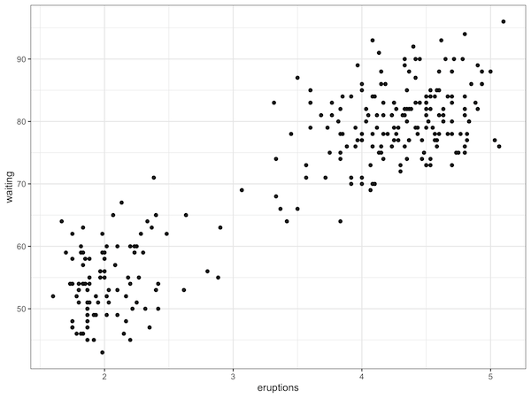
A scatter plot with default font size
Let us make a simple scatter plot in R using ggplot2. We will change the theme of the plot to theme_bw() from the default theme_grey() in ggplot2.
# make simple scatter plot
faithful %>%
  ggplot(aes(x=eruptions,y=waiting)) +
  geom_point() +
  theme_bw()
By default, in ggplot2, the text size along the axes in ggplot is pretty small. If you save the plot and use it in a document, the axis text will not be legible at all. See the example scatter plot below and notice how small the axis label text is.
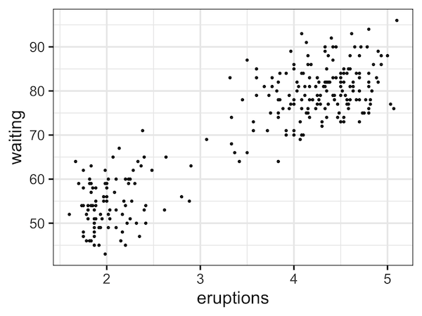
Increasing the font size using theme’s base_size
There are more than one way to increase the axis label font. Since we are already using a theme definition for our plot with theme_bw(), we can change the text font size of axes labels and the tick mark labels at one go.
We can increase the axis label size by specifying the argument base_size=24 inside theme_bw().
faithful %>%
  ggplot(aes(x=eruptions,y=waiting)) +
  geom_point() +
  theme_bw(base_size=24)
ggplot2 uses the specified base_size and increases label text and tick text as shown below
theme_bw(base_size = 11,
         base_family = "",
         base_line_size = base_size/22,
         base_rect_size = base_size/22)
Now, we can see that we have increased the font size of text on both the axes and the tick mark text.
If you are interested in customizing the plot you made with ggplot2 in R, you might want to check out the post on how to change axis labels, how to add multi-line axis labels, and how to set title & subtitle to a plot made with ggplot2.
Explore the Complete ggplot2 Guide
35+ tutorials with code: scatterplots, boxplots, themes, annotations, facets, and more—tested and beginner-friendly.
Visit the ggplot2 Hub → No fluff—just code and visuals.