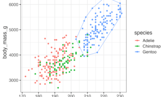
Encircle Data Points in R with geom_encircle() When working with scatter plots in R, it is often helpful to highlight or emphasize groups of data points. The ggalt package provides an elegant solution through the geom_encircle() function. This function automatically draws … [Read more...] about How to encircle a set of points in R with ggplot2
R
How to Wrap Long Titles in ggplot2 (5 Methods with Examples)
Why Long Titles Get Cut Off in ggplot2 When working with ggplot2 in R, long titles often get truncated or extend beyond the plot area, making your visualization look unpolished. Fortunately, there are multiple ways to break or wrap a long title into multiple lines. In … [Read more...] about How to Wrap Long Titles in ggplot2 (5 Methods with Examples)
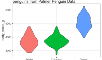
How to write a function make histograms with ggplot

In this tutorial, we will learn how to write a function to make a histograms using ggplot2 in R. Writing a function to create plots is useful, when you make a lot of plots, in this example, a lot of histograms. Thanks to the upcoming 2nd edition of R for Data Science by … [Read more...] about How to write a function make histograms with ggplot
Remove or Hide Legends in ggplot2 – Theme, Guides, Scales & Tips
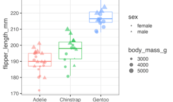
Legends in ggplot2 are powerful but can sometimes clutter your visualization. In this tutorial using ggplot2 in R, we’ll walk step by step through methods to hide all legends, remove specific ones like color or shape, control them at the layer level, and even tidy them with scale … [Read more...] about Remove or Hide Legends in ggplot2 – Theme, Guides, Scales & Tips
How to Visualize Missing Values in a dataframe as heatmap
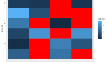
In this post, we will learn how to visualize a dataframe with missing values represented as NAs as a heatmap. A quick visualization of missing values in the data is useful in analyzing the data. We will use mainly tidyverse approach, first to create a toy dataframe with missing … [Read more...] about How to Visualize Missing Values in a dataframe as heatmap