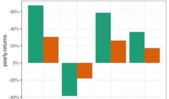
This tutorial teaches you how to color words in a ggplot title to match the data in the plot itself. This approach has two main benefits: Improves interpretation: Readers can understand the chart more quickly. Reduces clutter: It can eliminate the need for a … [Read more...] about How to Add matching colors to keywords in title text
R
How to selectively add color to title text in ggplot2
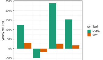
In this tutorial, we will learn how to specify colors to selective words of title text in ggplot2. For example, if we had made a plot with ggplot2 and have title text to describe the plot, we will learn how to color certain words of the title not the whole title text. We will … [Read more...] about How to selectively add color to title text in ggplot2
How to wrap long strip labels in facet_wrap
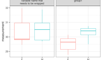
Do long strip labels in facet_wrap() break your ggplot2 plots? When labels are too long, they can become unreadable. This tutorial shows you how to automatically wrap them. You'll learn to use a labeller function to control the width of your facet labels, keeping your … [Read more...] about How to wrap long strip labels in facet_wrap
How to Turn off “missing values have been dropped” warning message in ggplot2
In this post, we will learn how to turn off the "missing values" warning message from ggplot2, when making a scatterplot with data containing missing values. geom_point() in ggplot2 gives a warning when it drops missing values from from the dataset it is plotting. Here is example … [Read more...] about How to Turn off “missing values have been dropped” warning message in ggplot2
How to add arrow to x /y axis in ggplot2
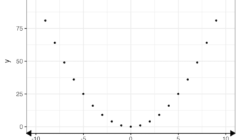
In this tutorial, we will learn how to add arrows to both x and y axis in a plot made with ggplot2 in R. When we make a plot with ggplot2, it does not add arrows at the end of either x or y axis by default. Sometimes you might want to add arrows to either x-axis or y-axis to the … [Read more...] about How to add arrow to x /y axis in ggplot2